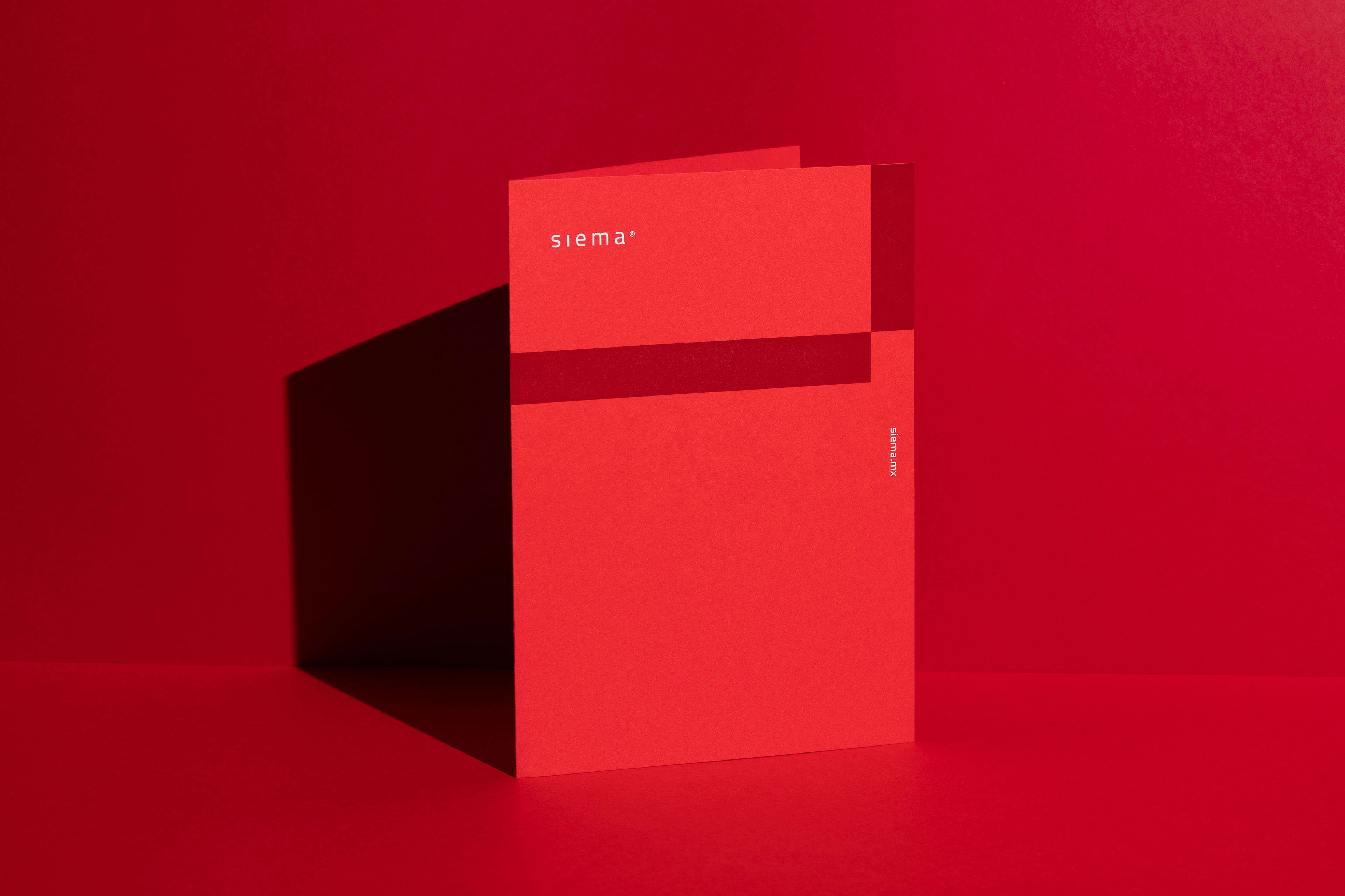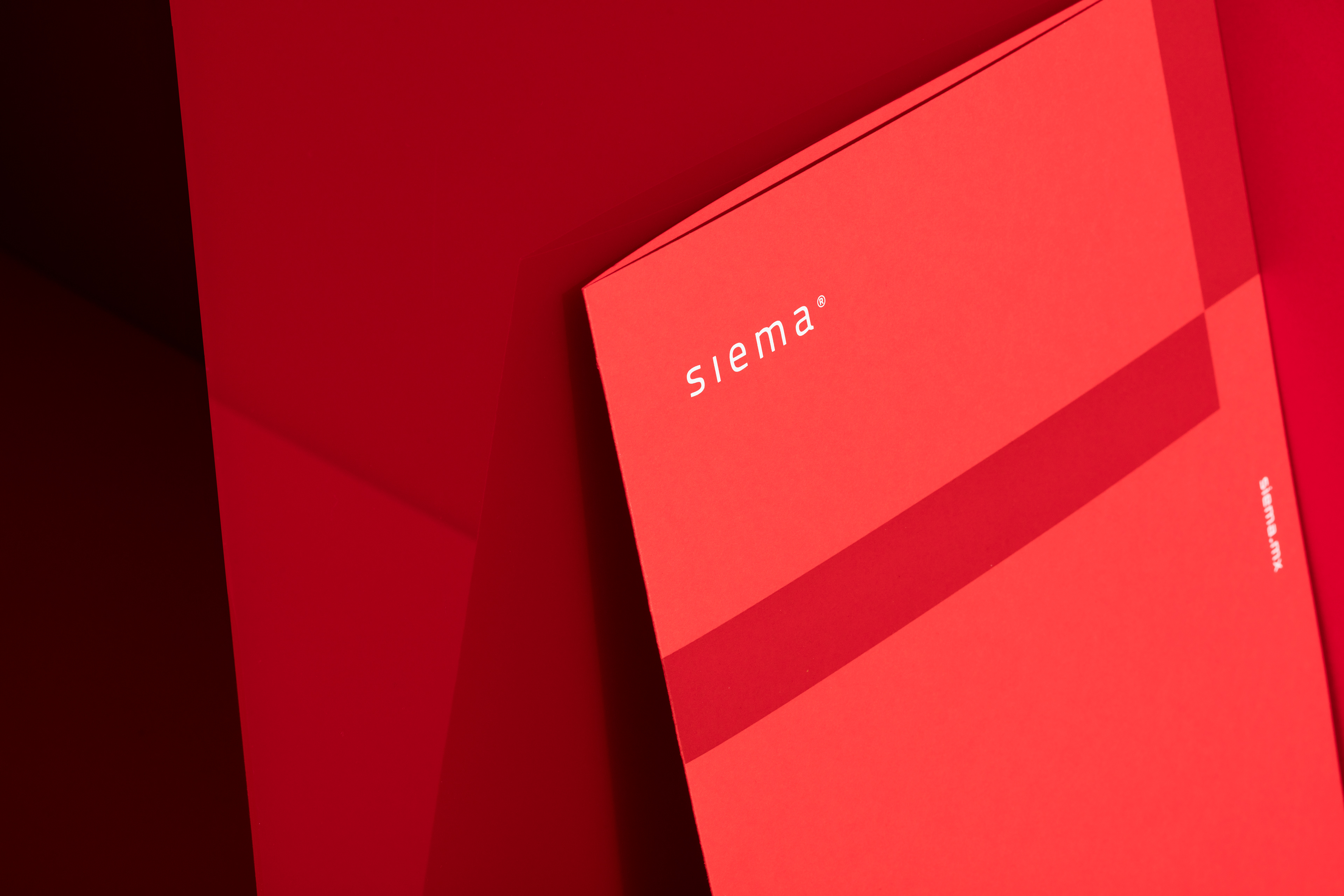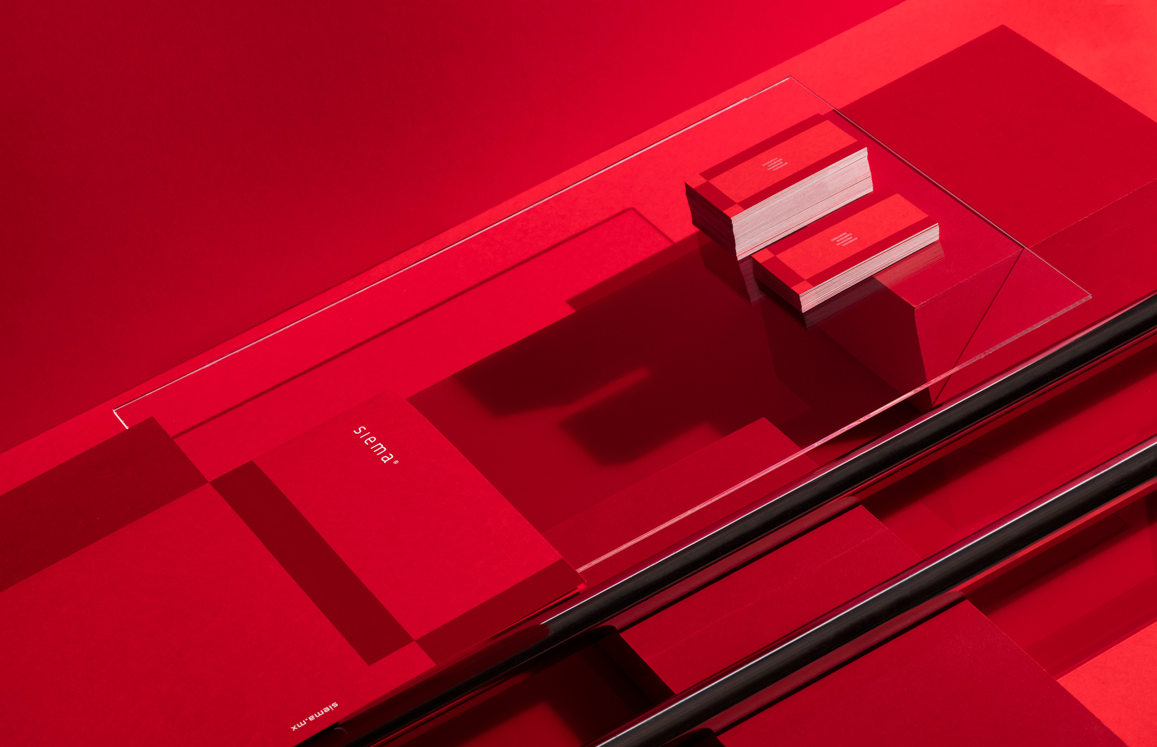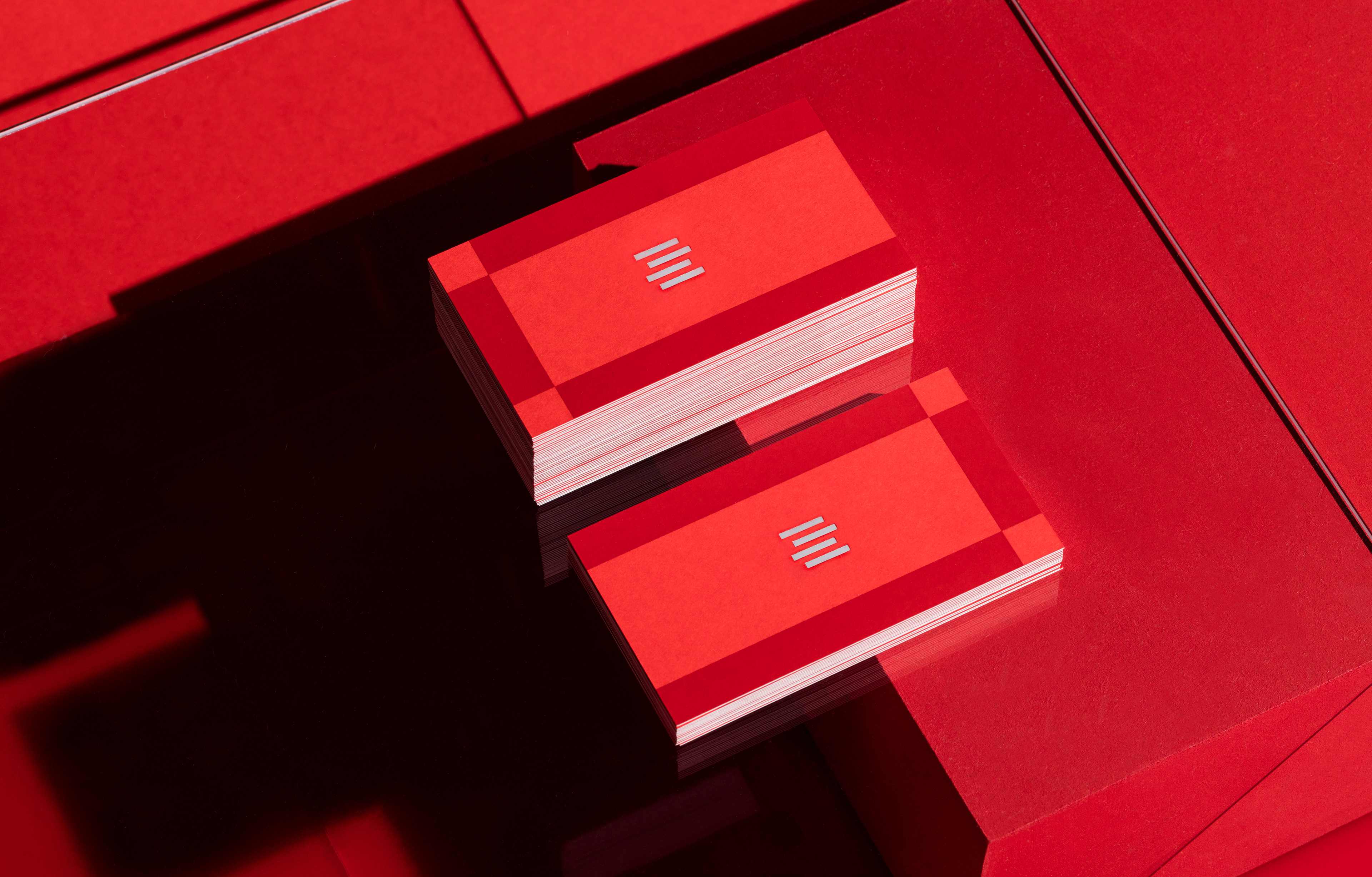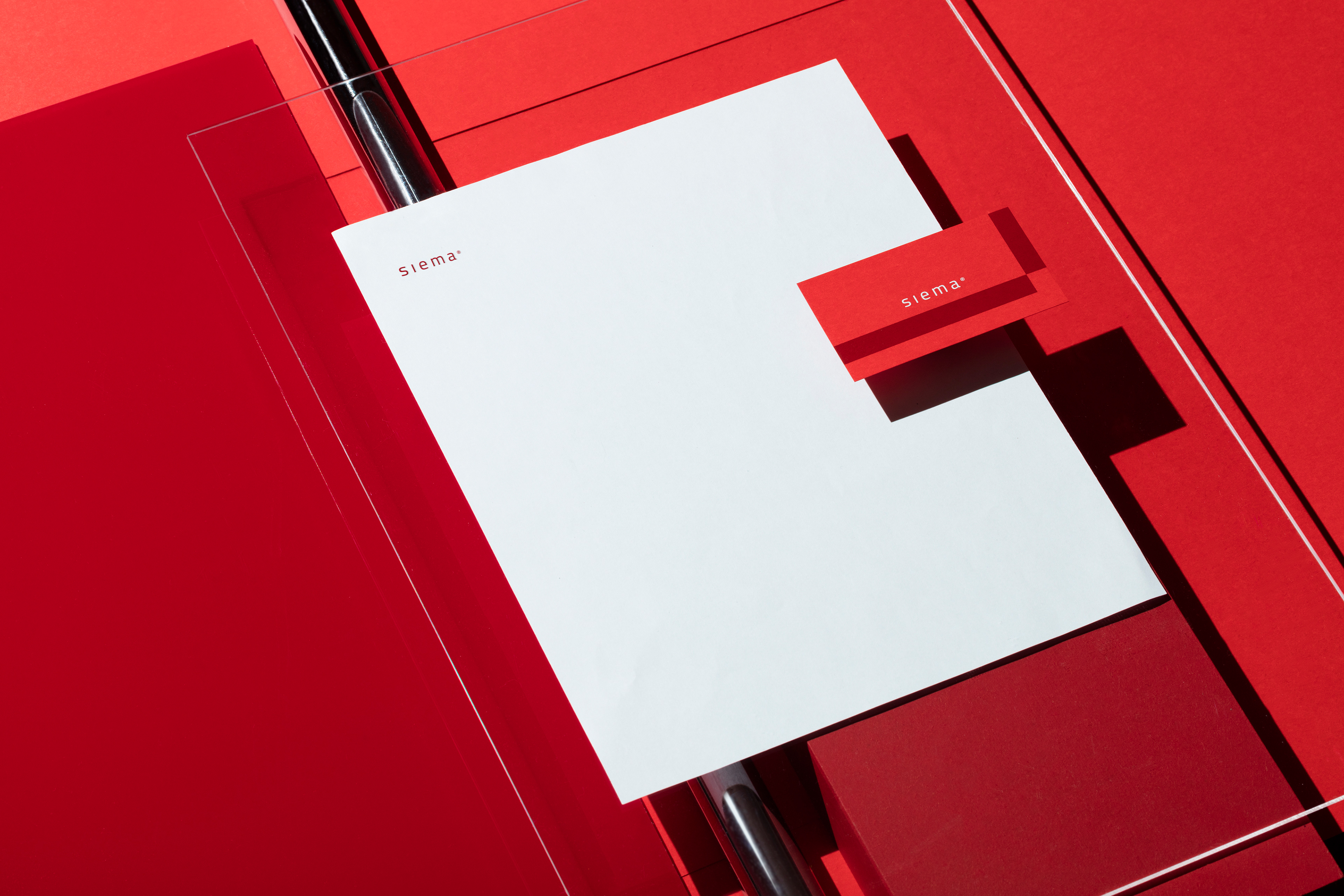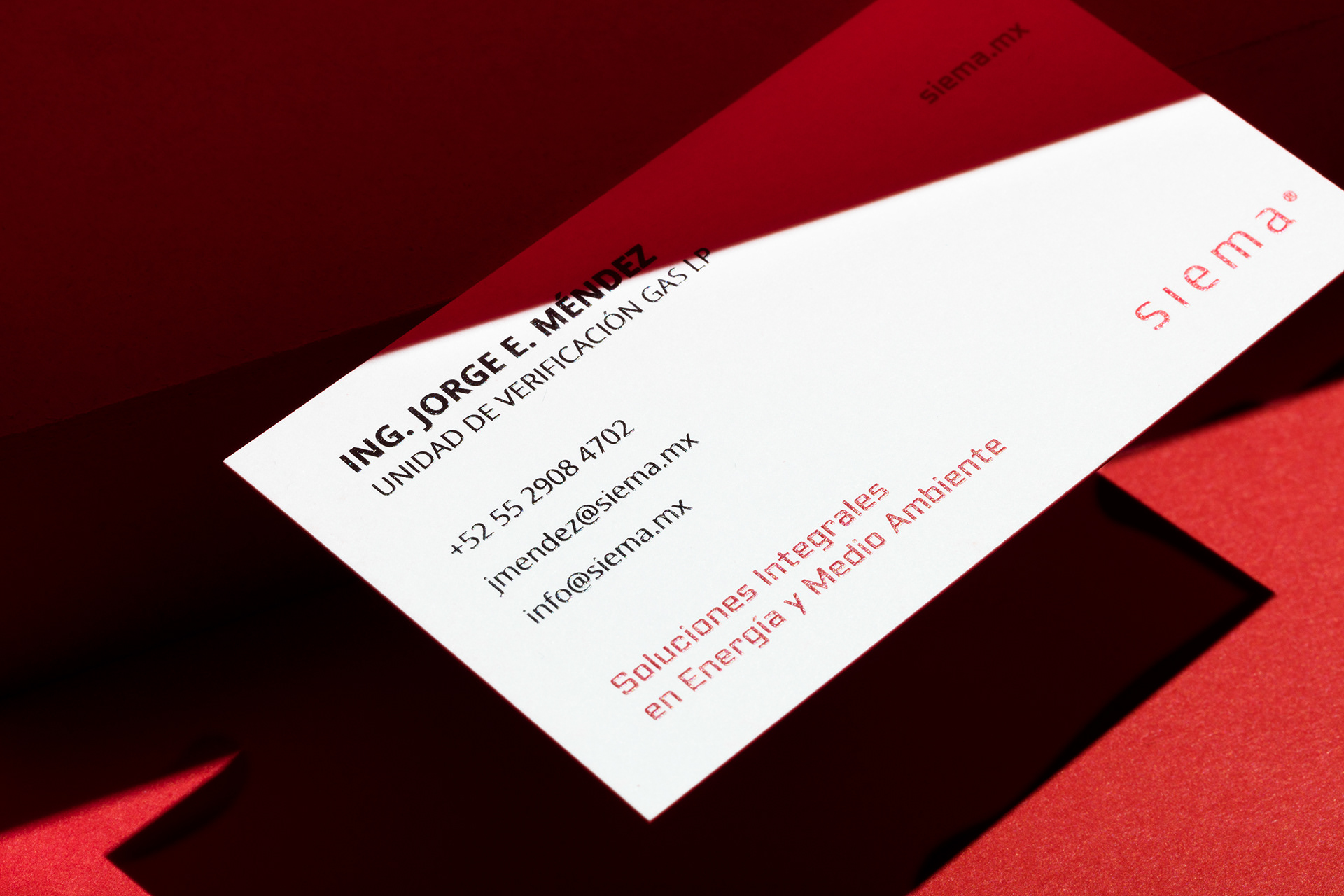

Siema/
Based in Mexico City, Siema is an integrated energy consultancy in Liquefied Natural Gas operations.
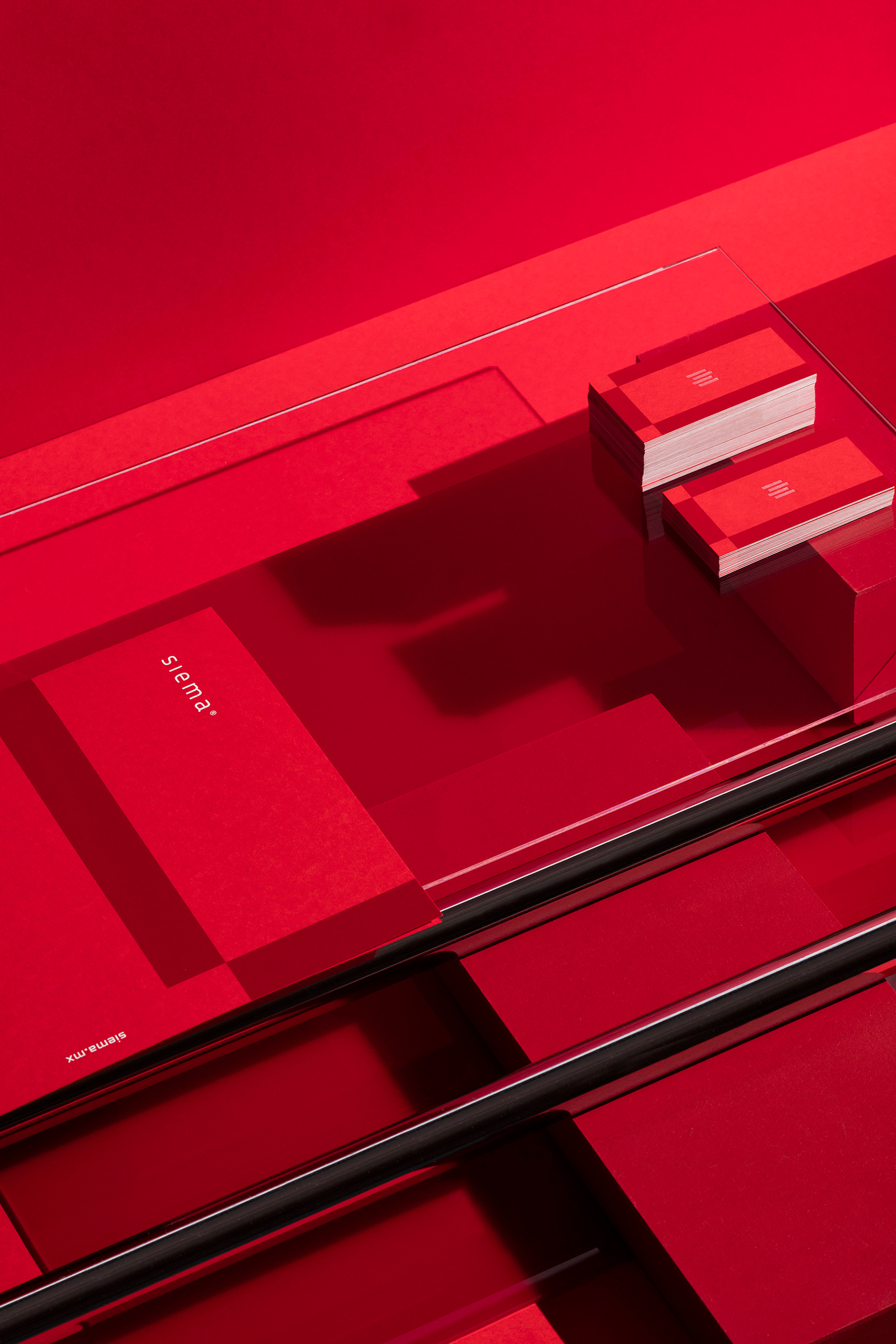
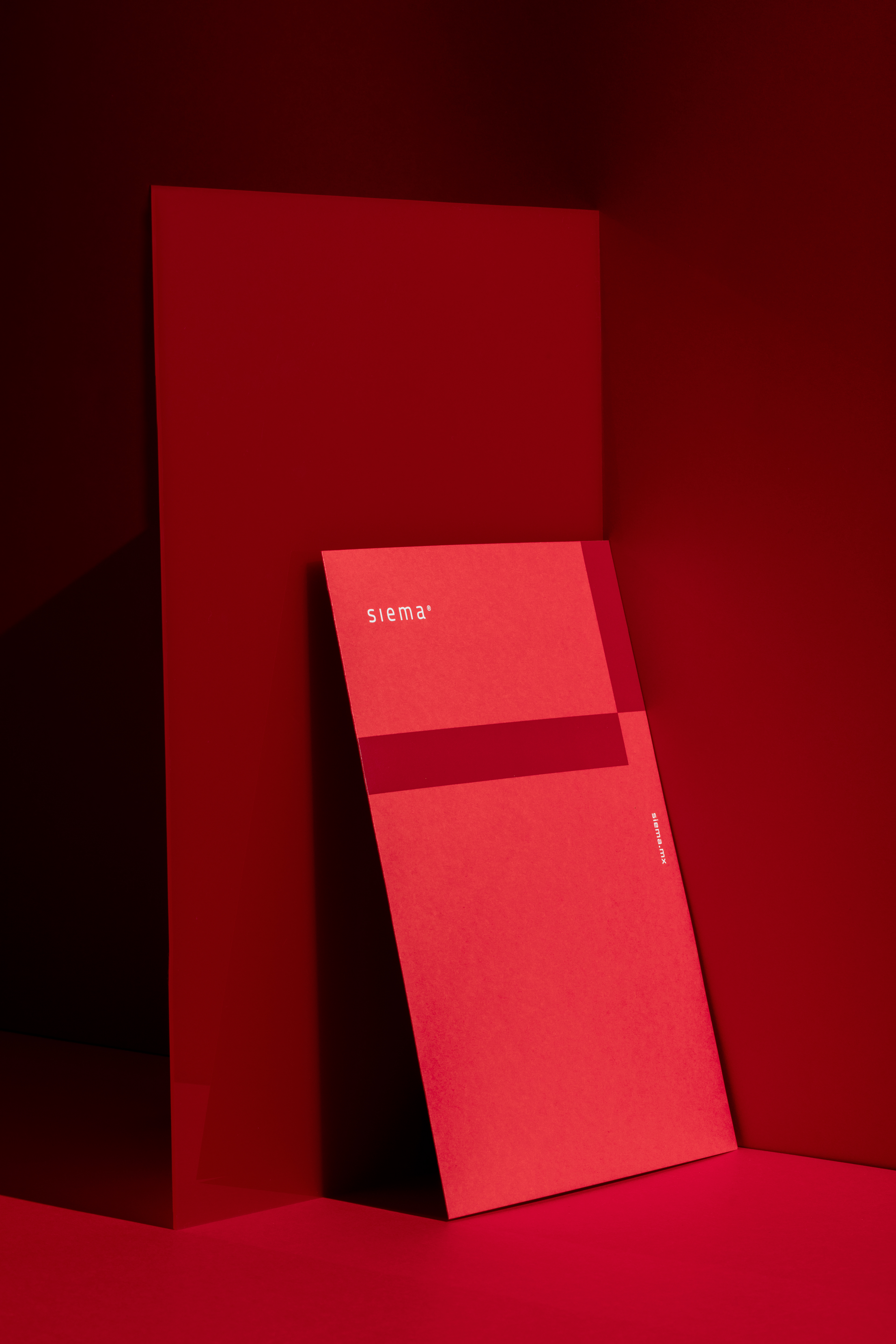
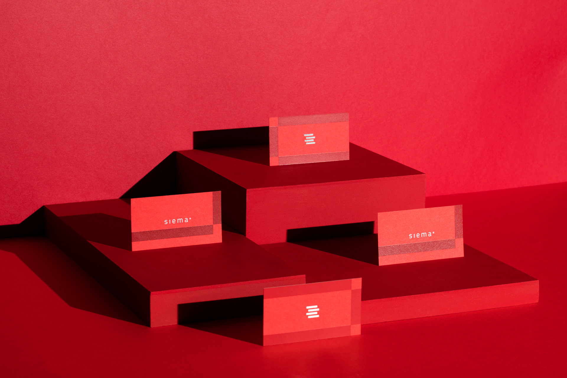
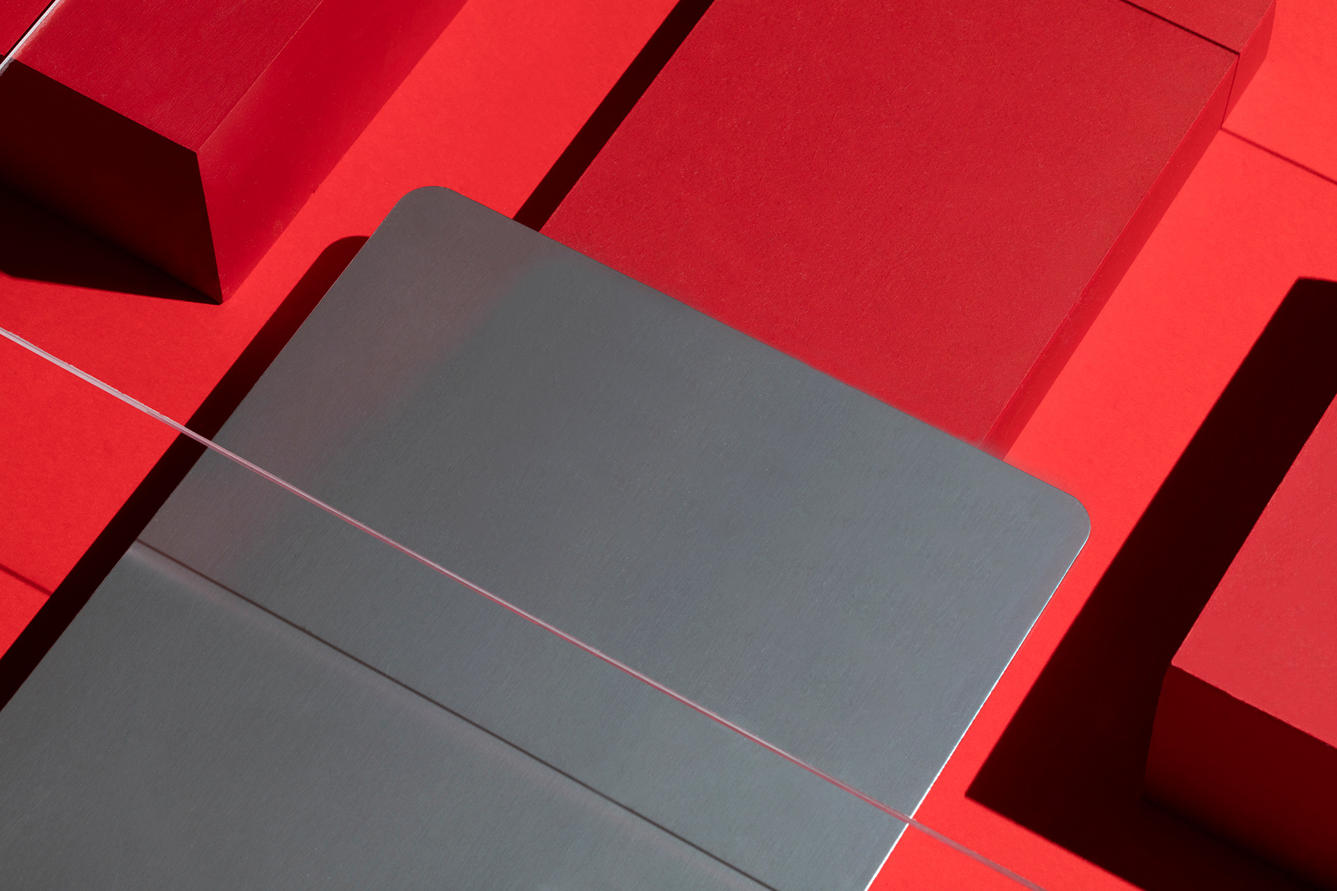
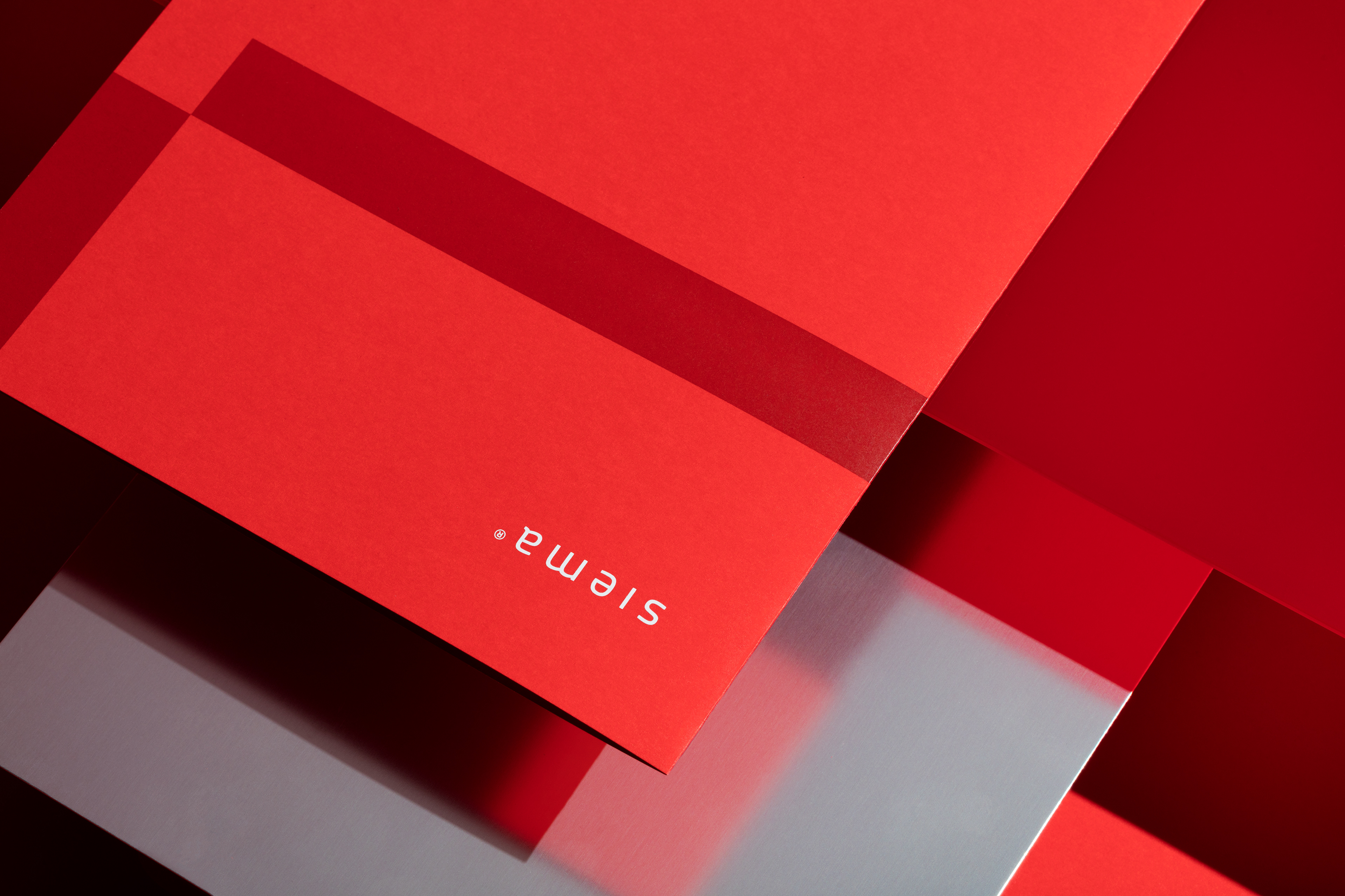
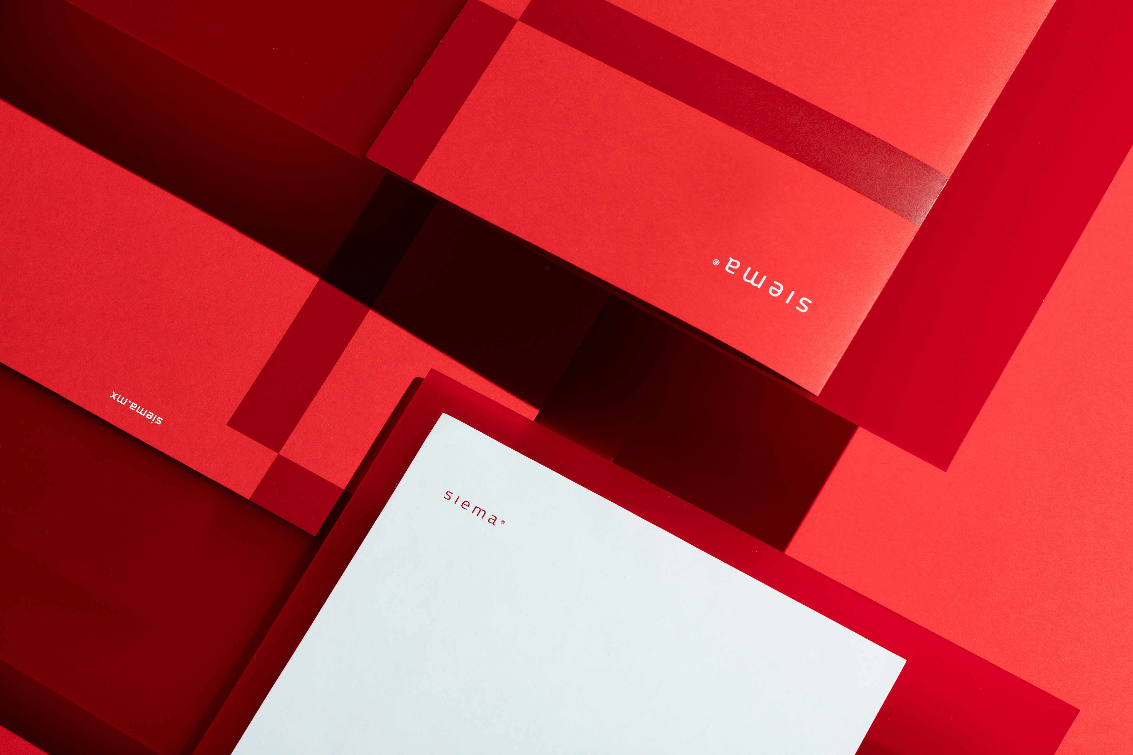
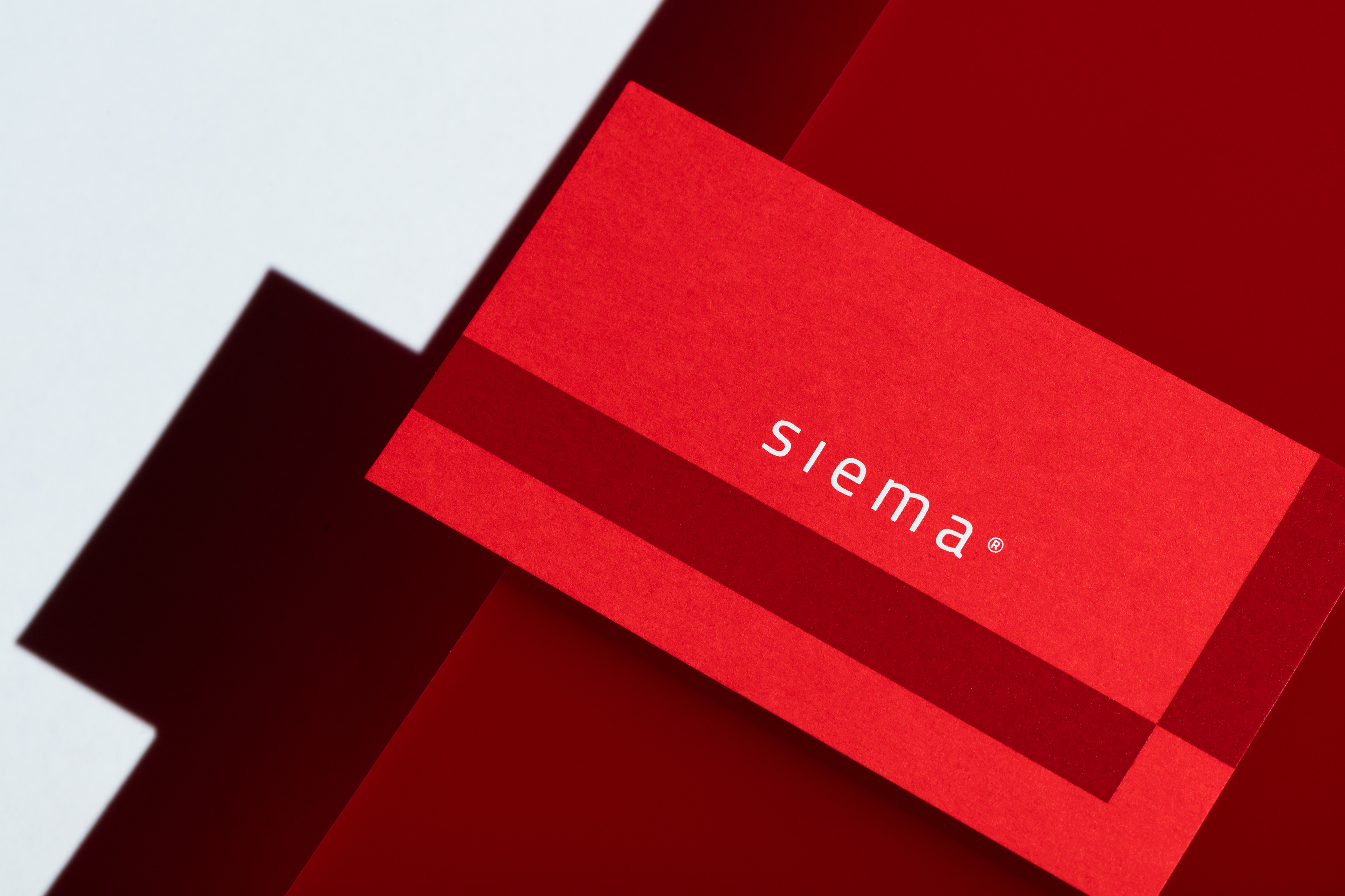
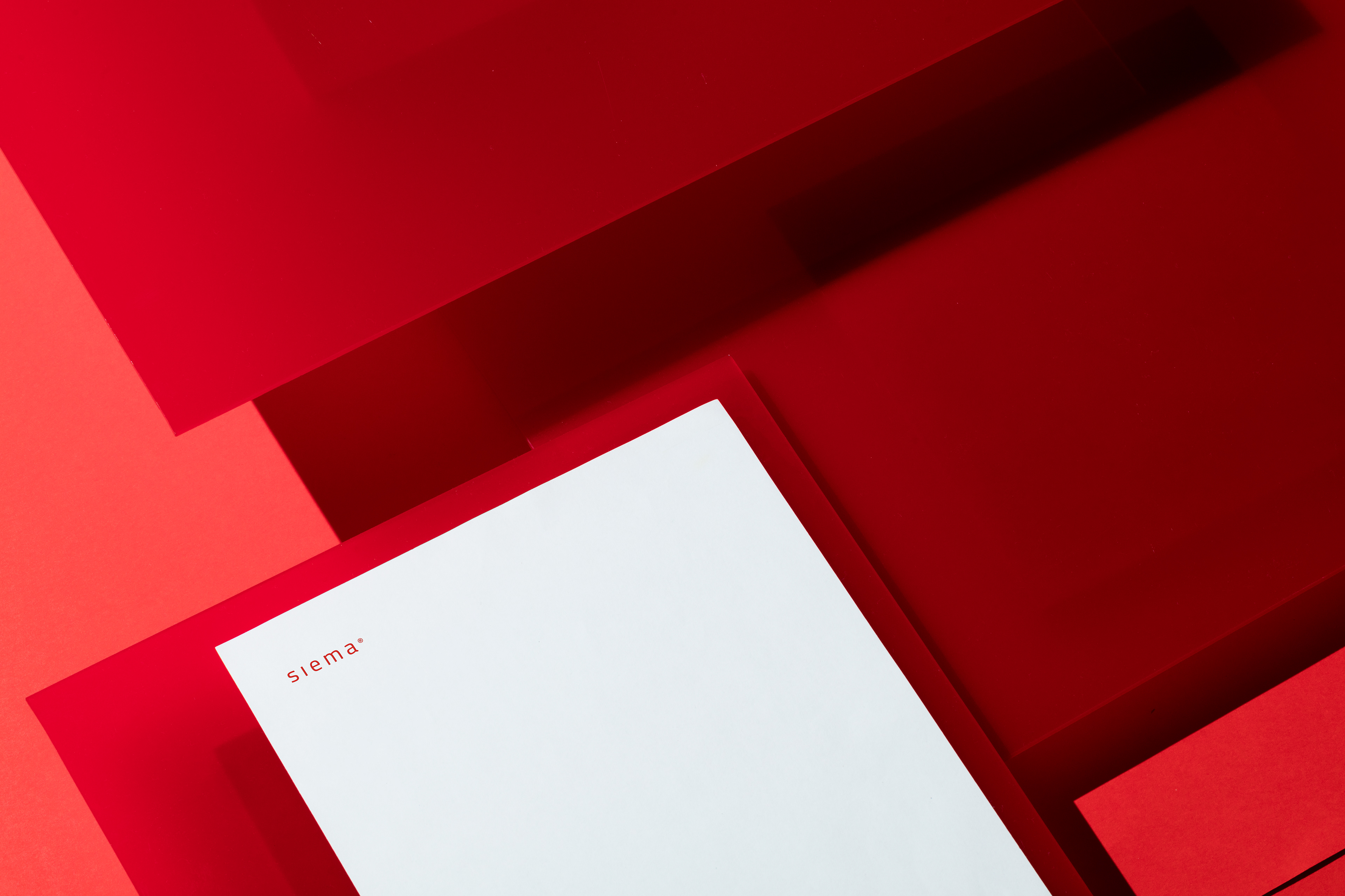
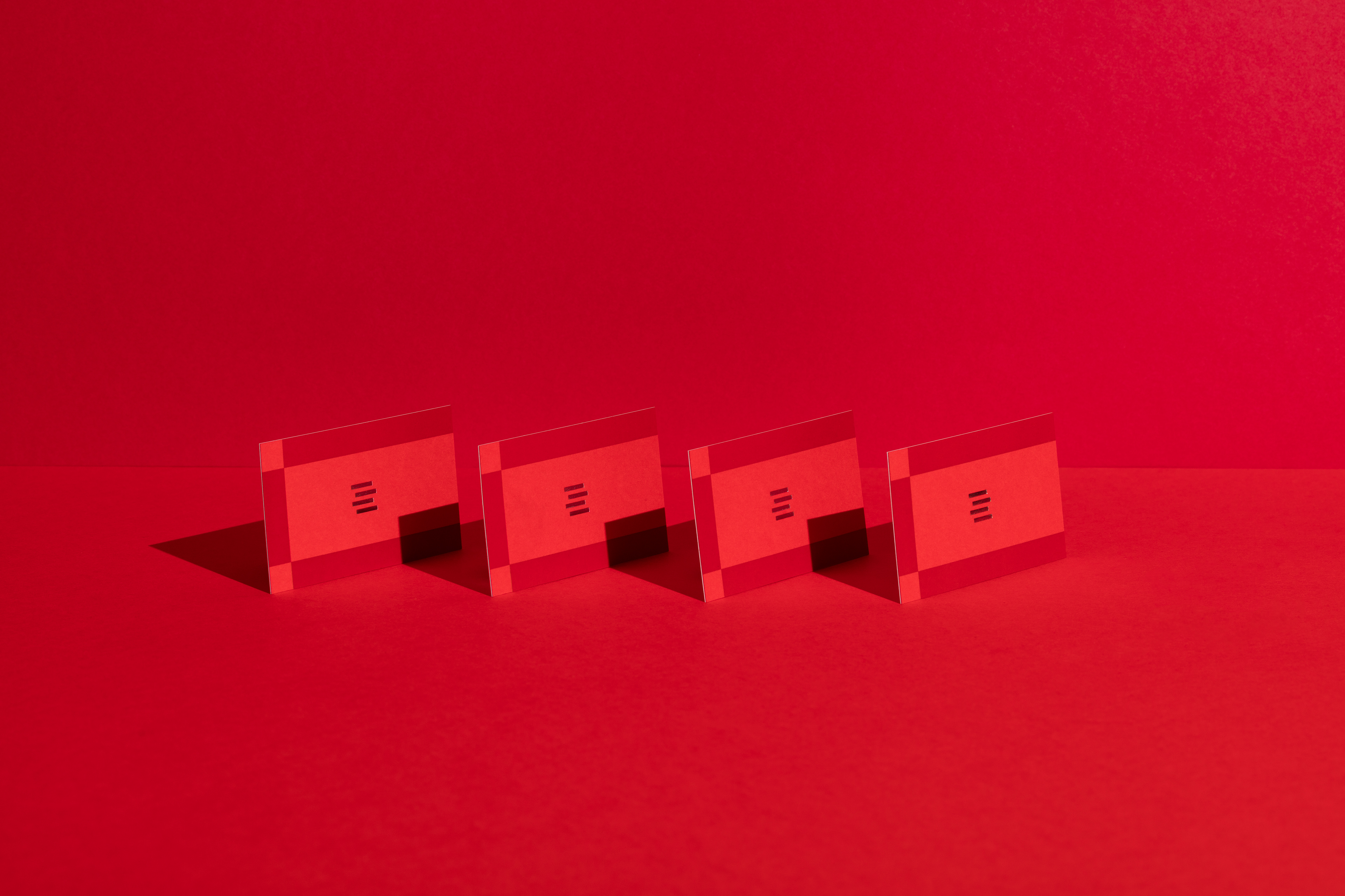
The Identity stands out for its intense color palette. Siema is a new brand in an old fashioned business so we had to create a modern statement to be perceived as a strategic ally and a professional innovative company.
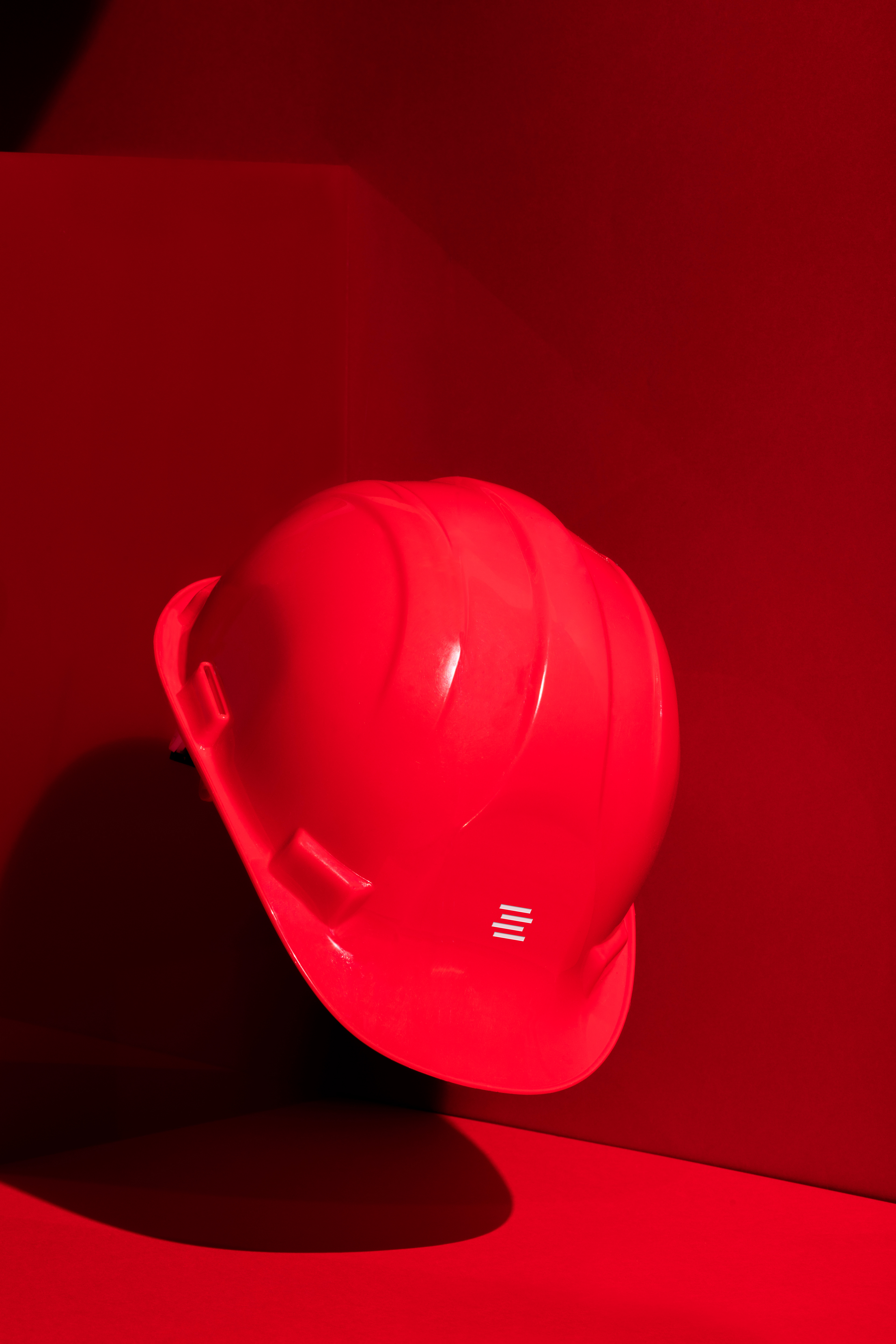
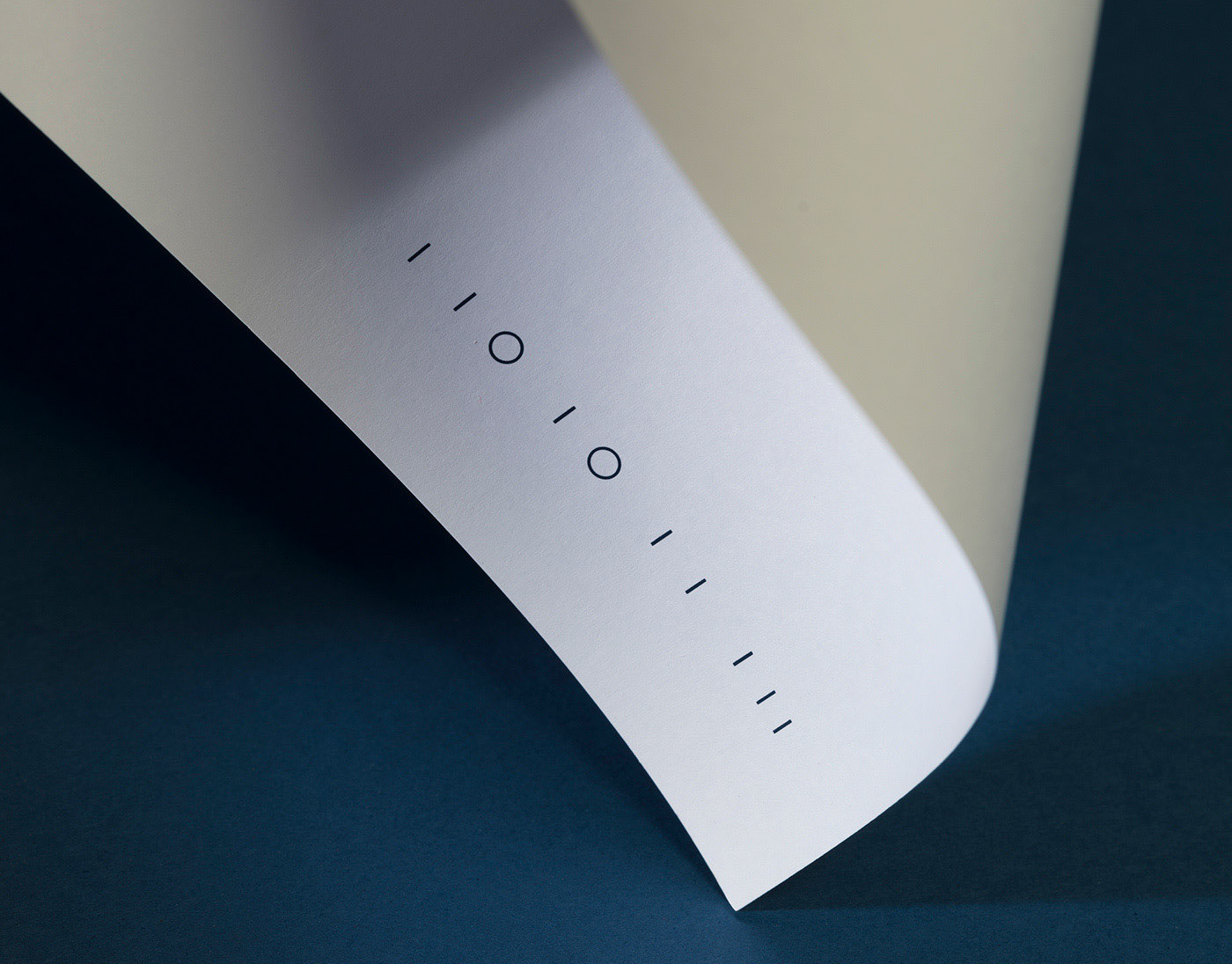
The icon represents in a simple and concise way, the main brand objective, an abstraction of a labyrinth and a letter "s" in negative space, emphasizing efficient solutions in a timely manner, it also creates the visual language of the brand, movement, rhythm and fluency.
The metallic foil represents the strength of the industry and heavy work.