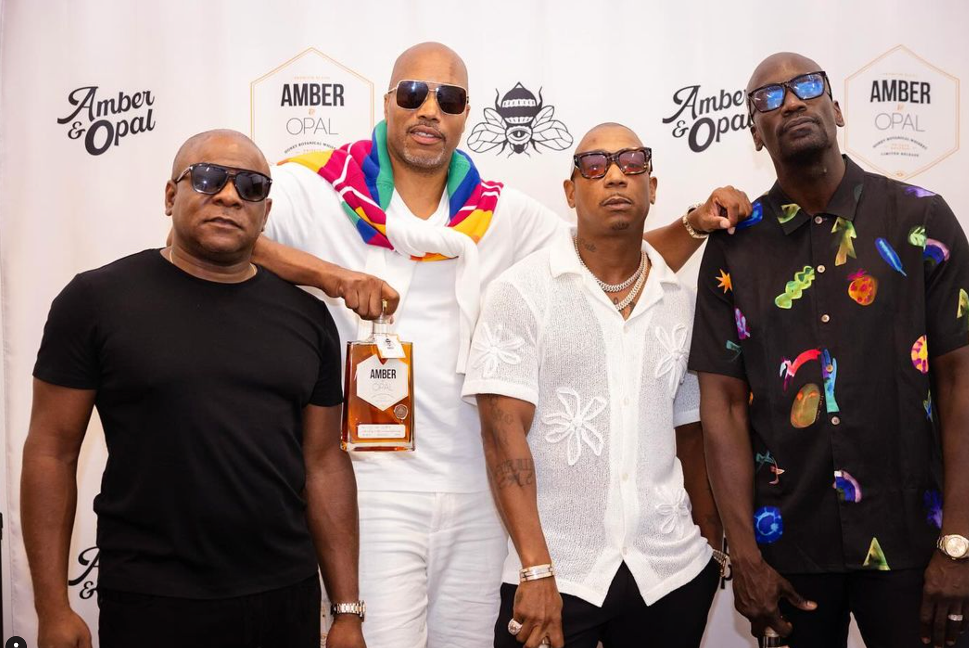
Amber & Opal, the signature whiskey of hip hop star Ja Rule.
In designing Amber & Opal’s identity, a Black-owned honey whiskey, we aimed to create a brand that embodies craftsmanship, community, and diversity. Drawing inspiration from the product itself and the rich symbolism bees carry, we crafted a bold bee icon enhancing the honey whiskey’s natural sweetness while representing artisanal skill.
The label design was crafted with intention, featuring a clean, minimal hexagonal shape that reflects simplicity and purpose. This shape symbolizes the strength of community, as when multiple bottles come together, they form a honeycomb—a metaphor for unity and collective power, core values of Amber & Opal.
Every design decision was deliberate, ensuring Amber & Opal’s visual identity is not only strong and inspiring but also reflects the passion and movement behind the brand.
Special thanks to Herb, Ja, Fes, and Kelvin for letting us craft your vision.
