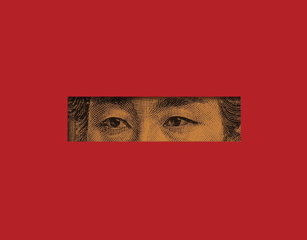

Mezcal Agua Blanca /
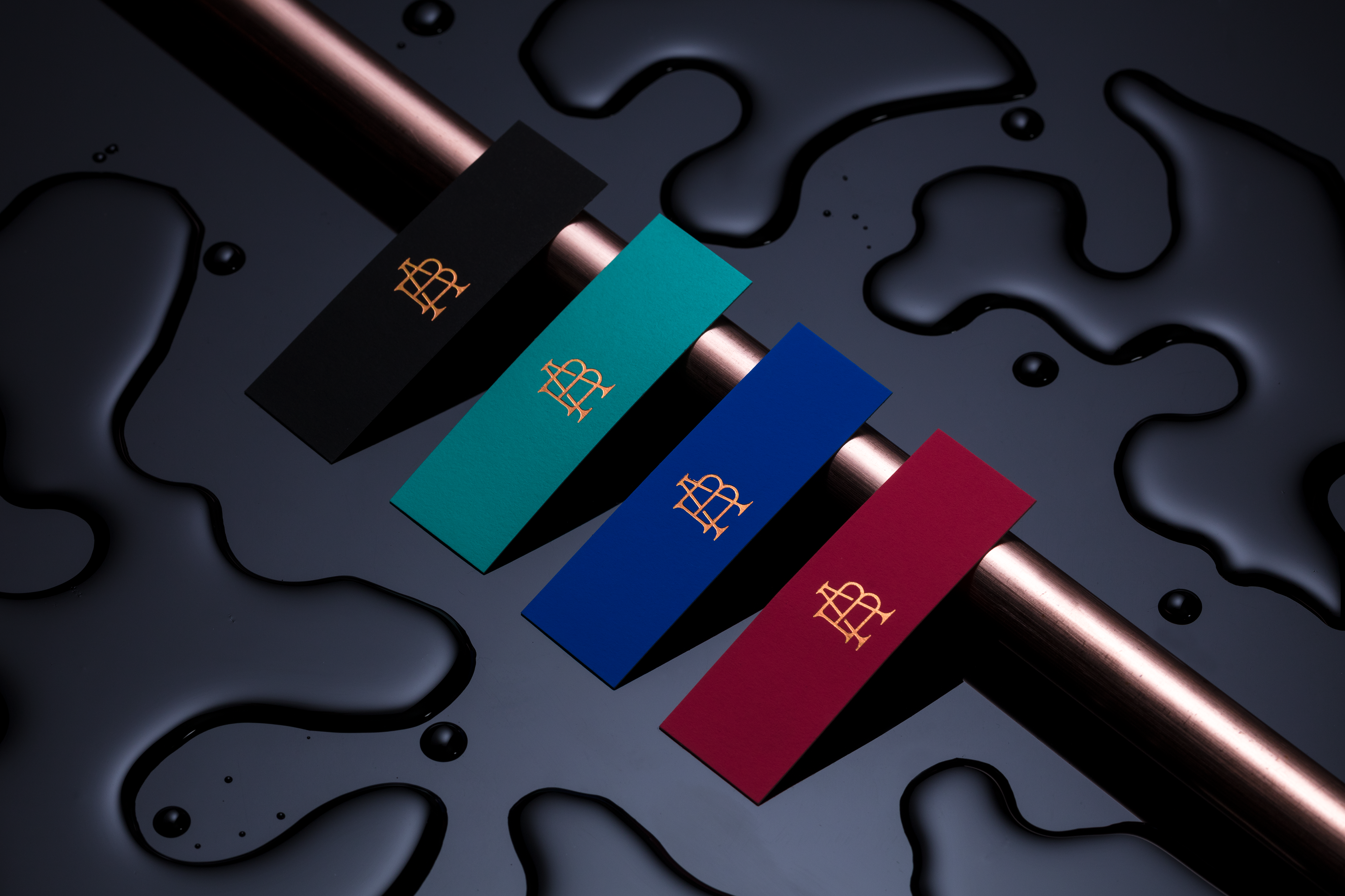
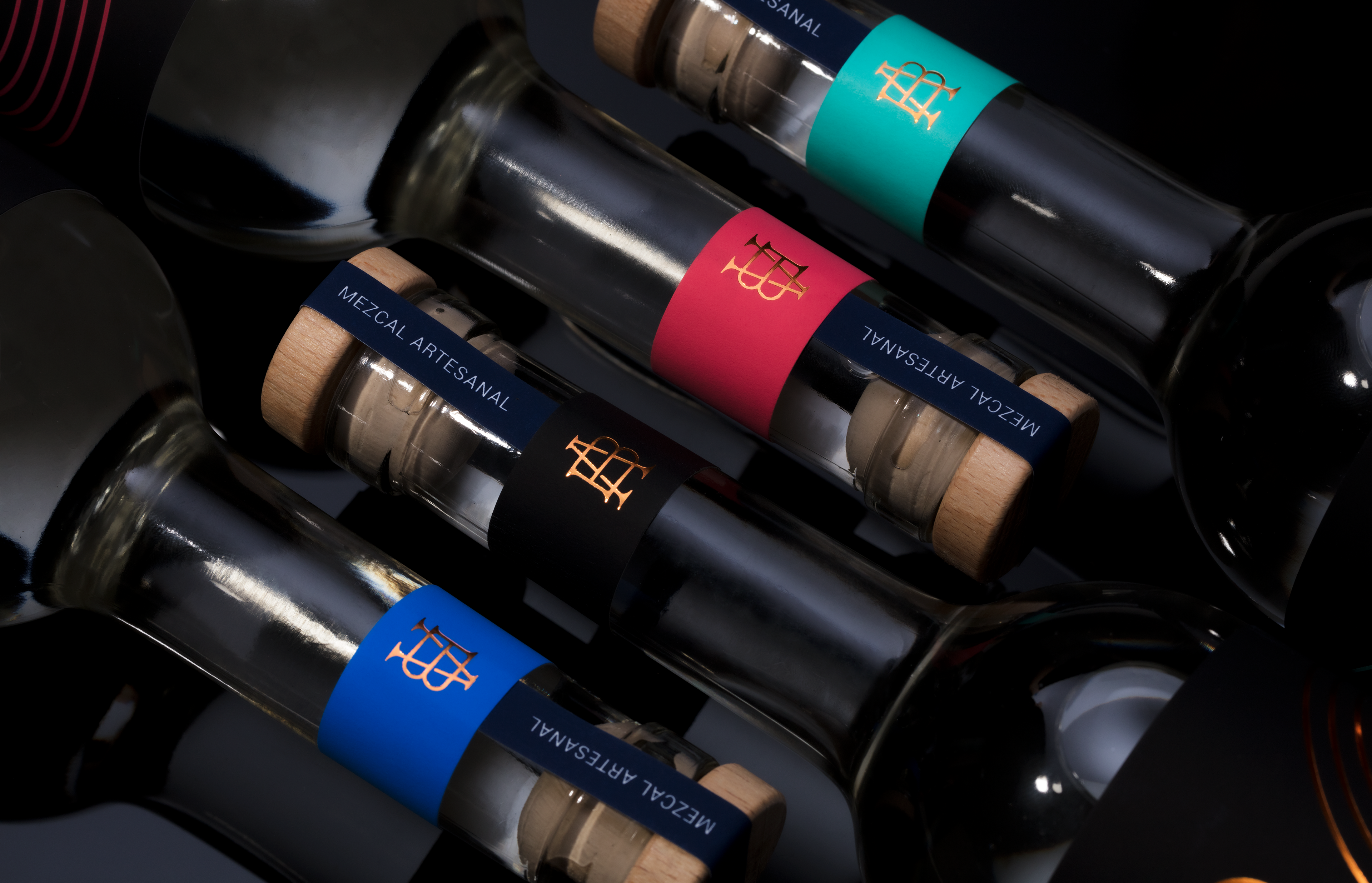
Brand development for Mezcal Agua Blanca.
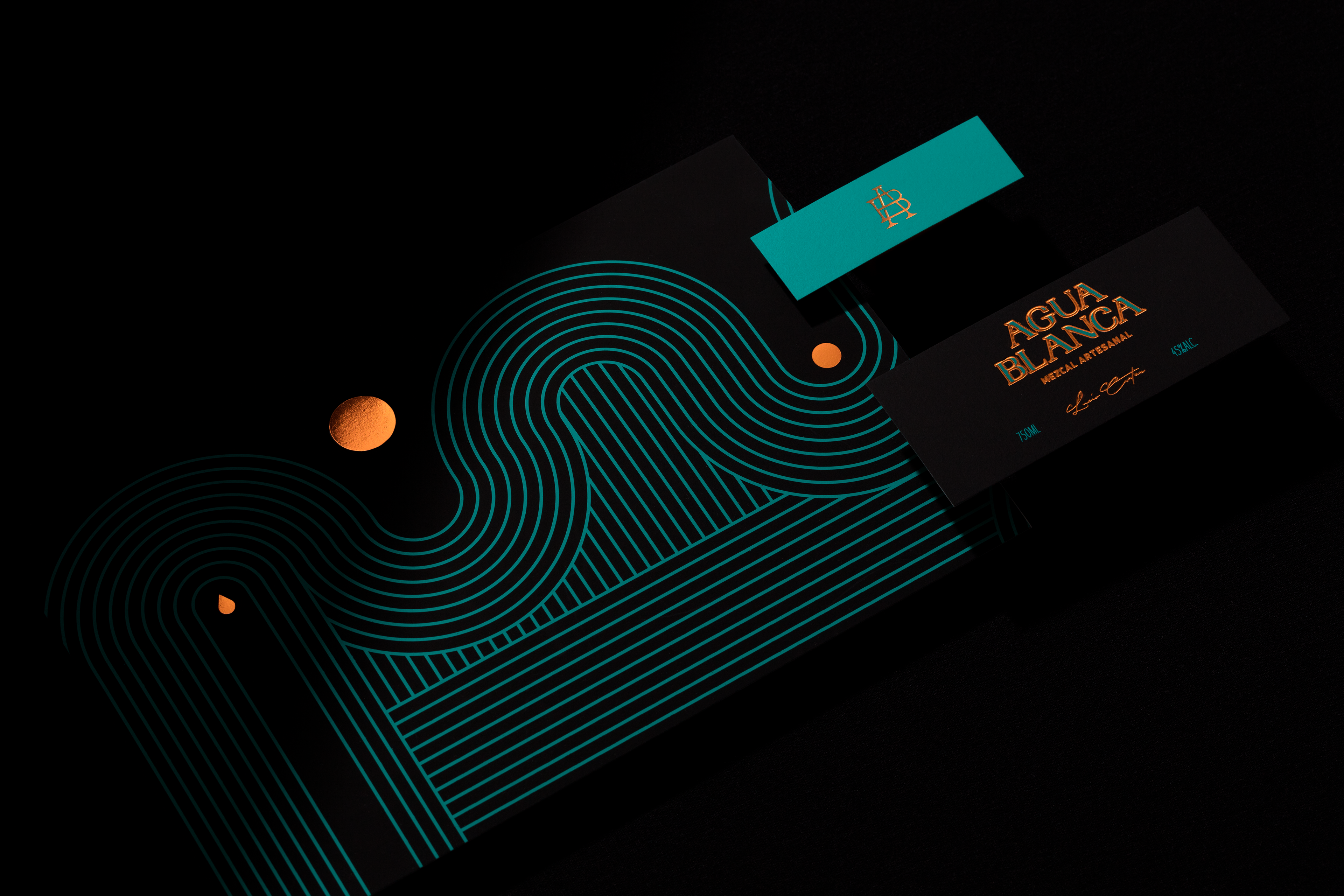
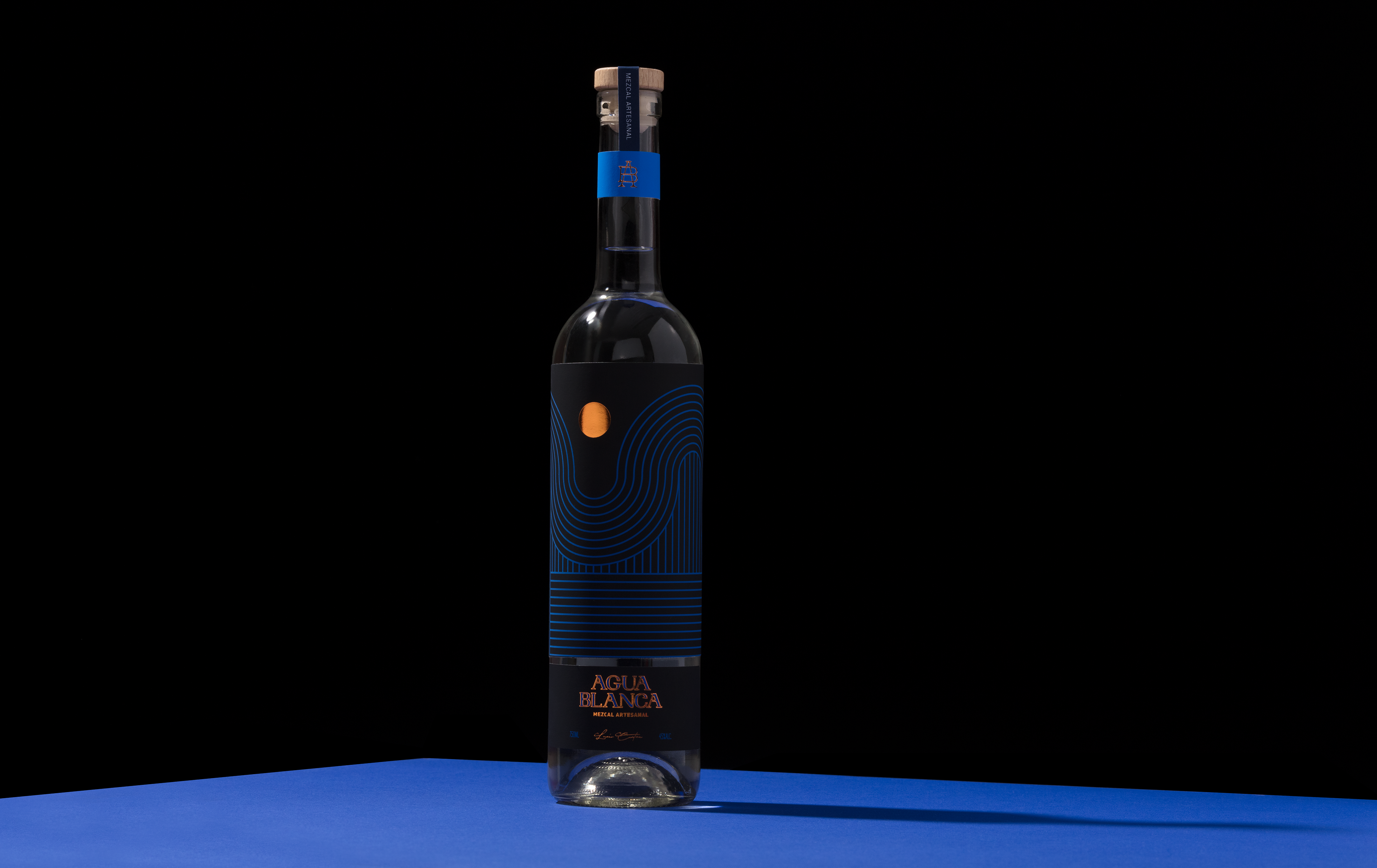
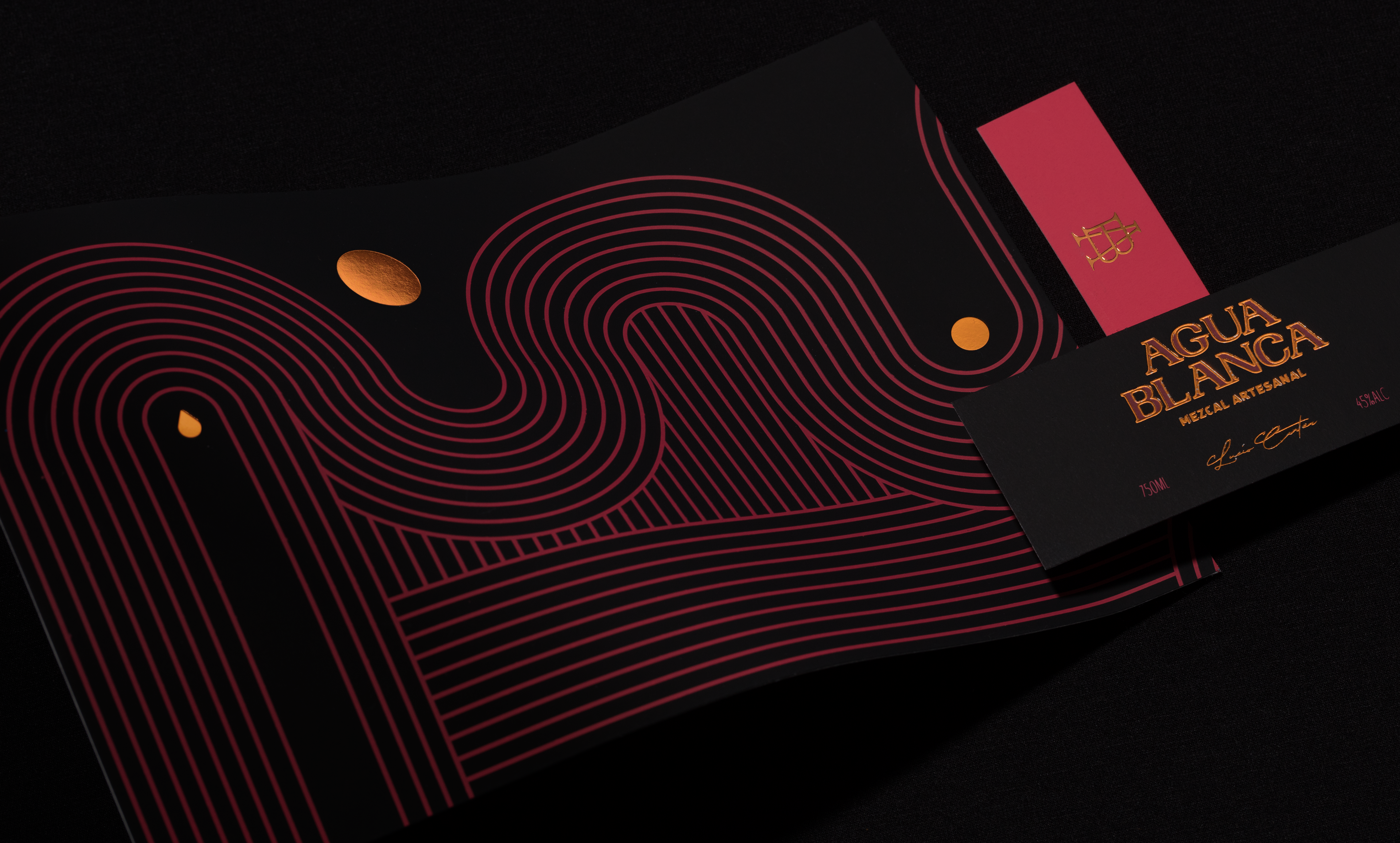
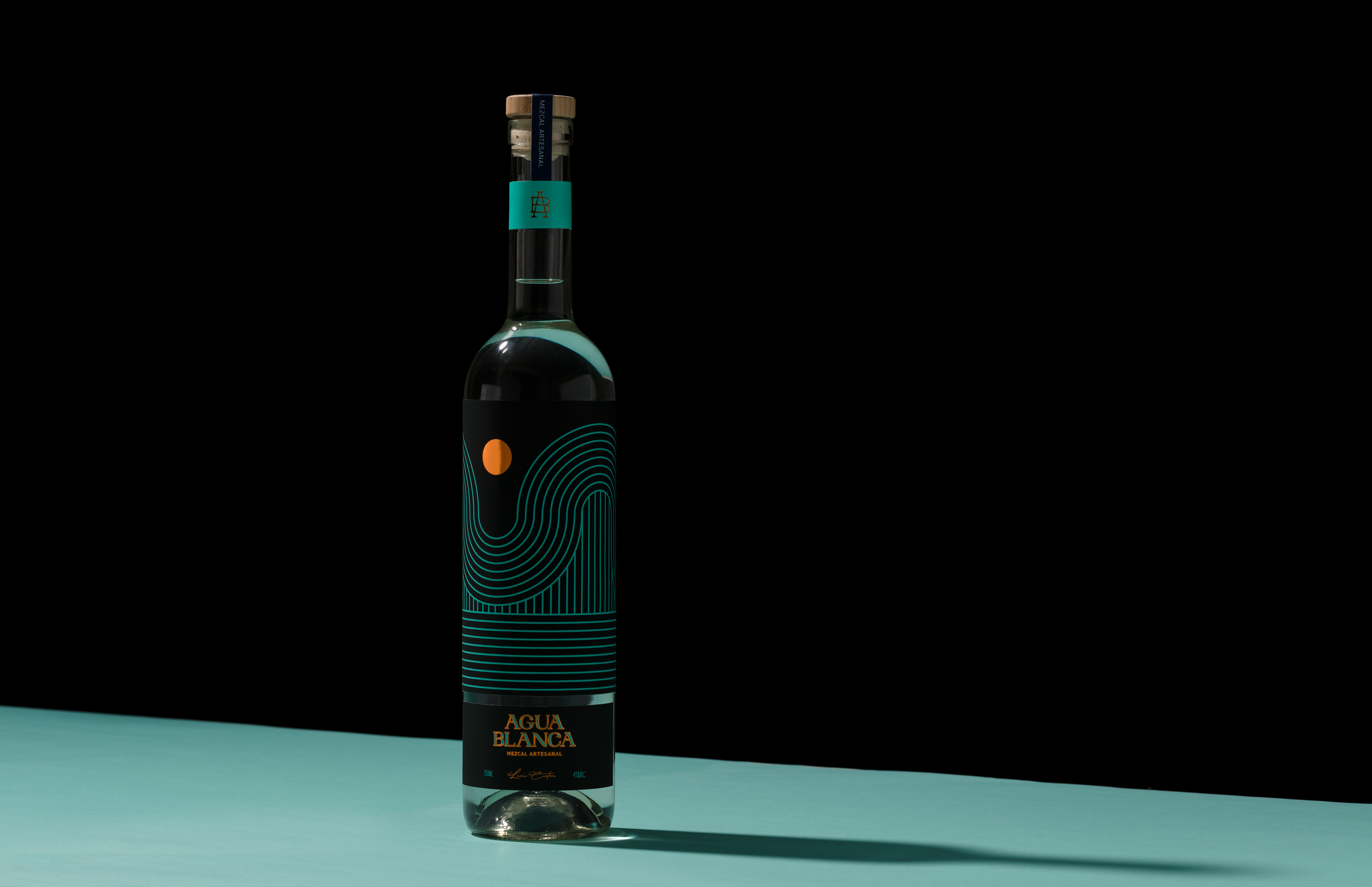
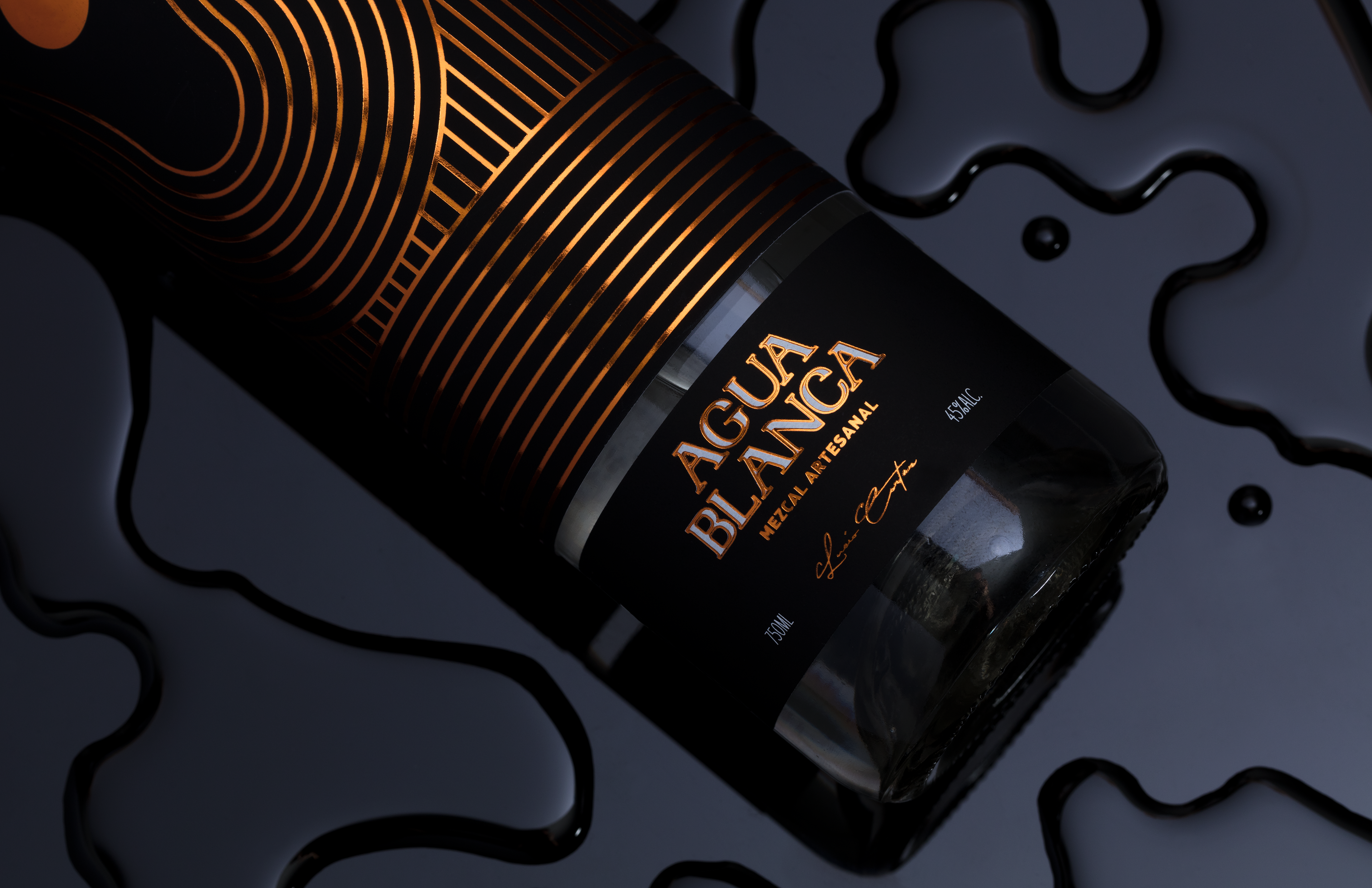
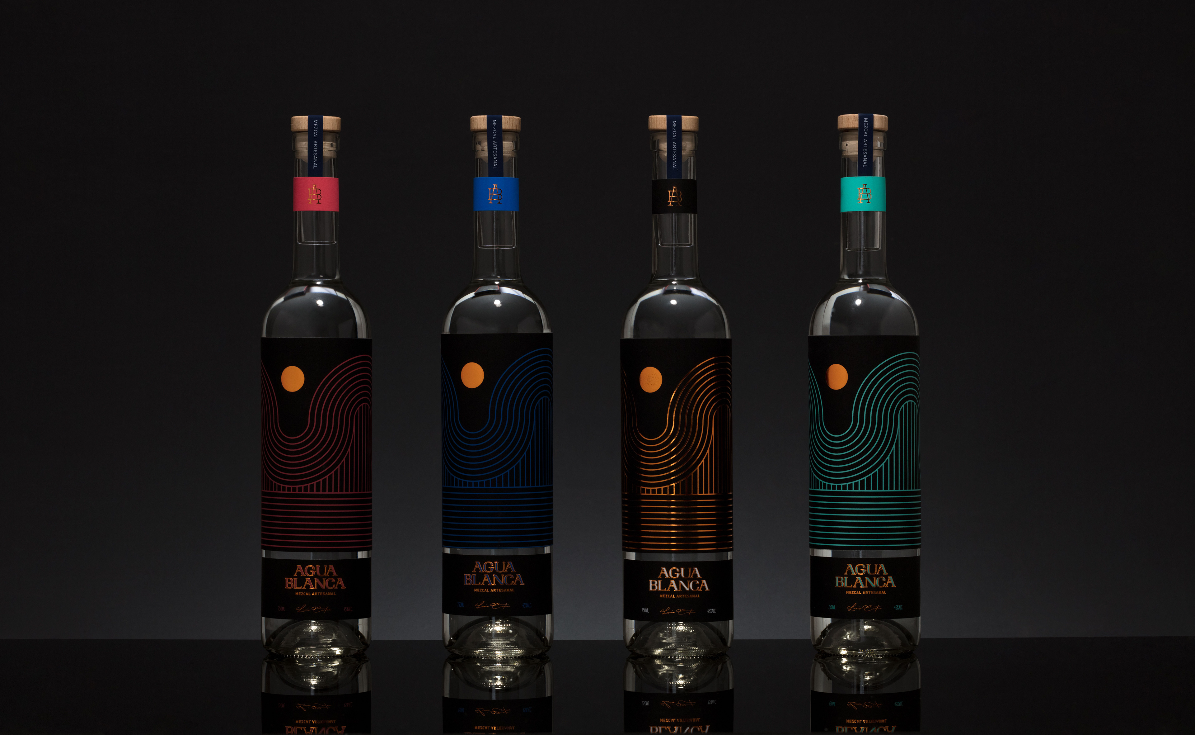
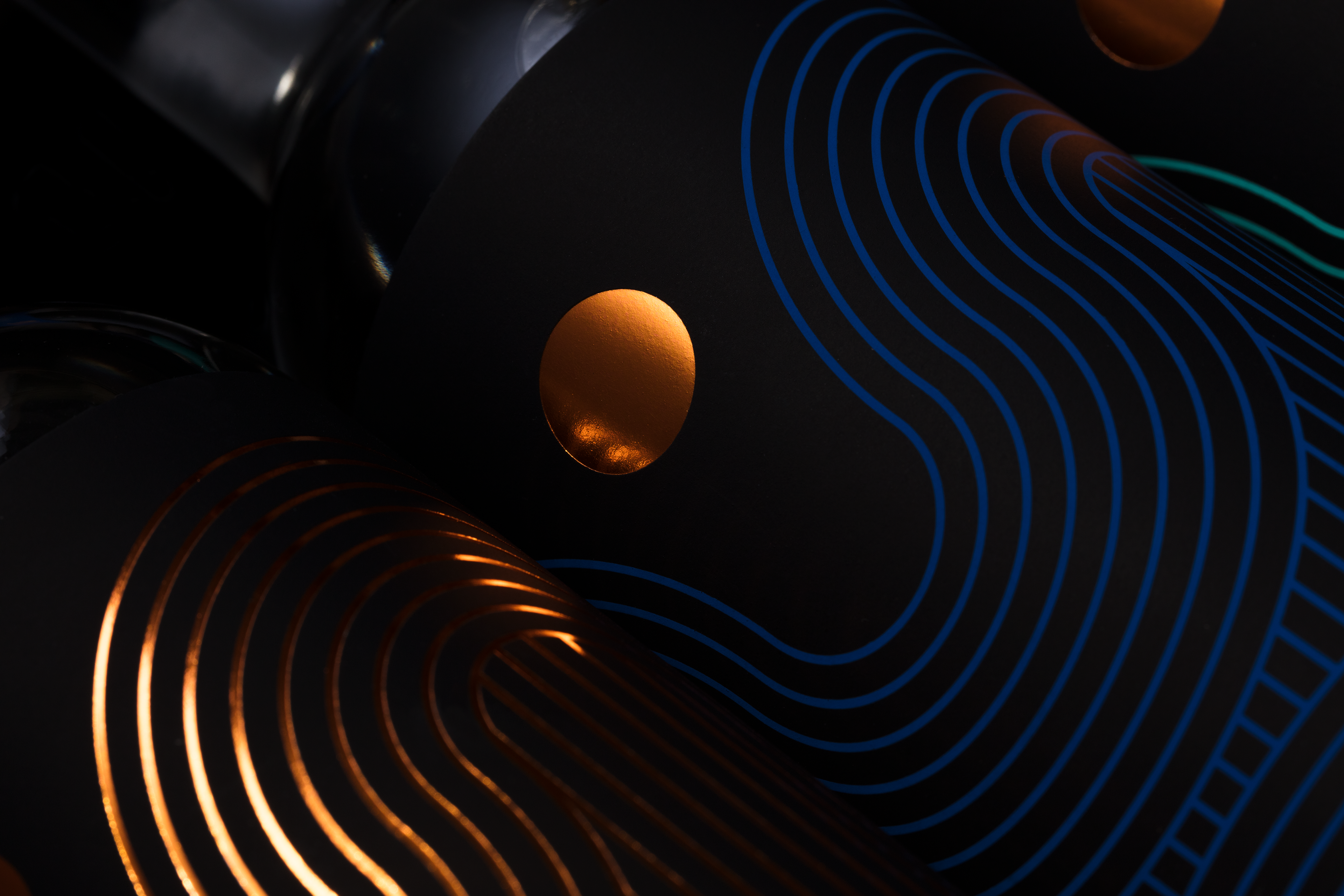
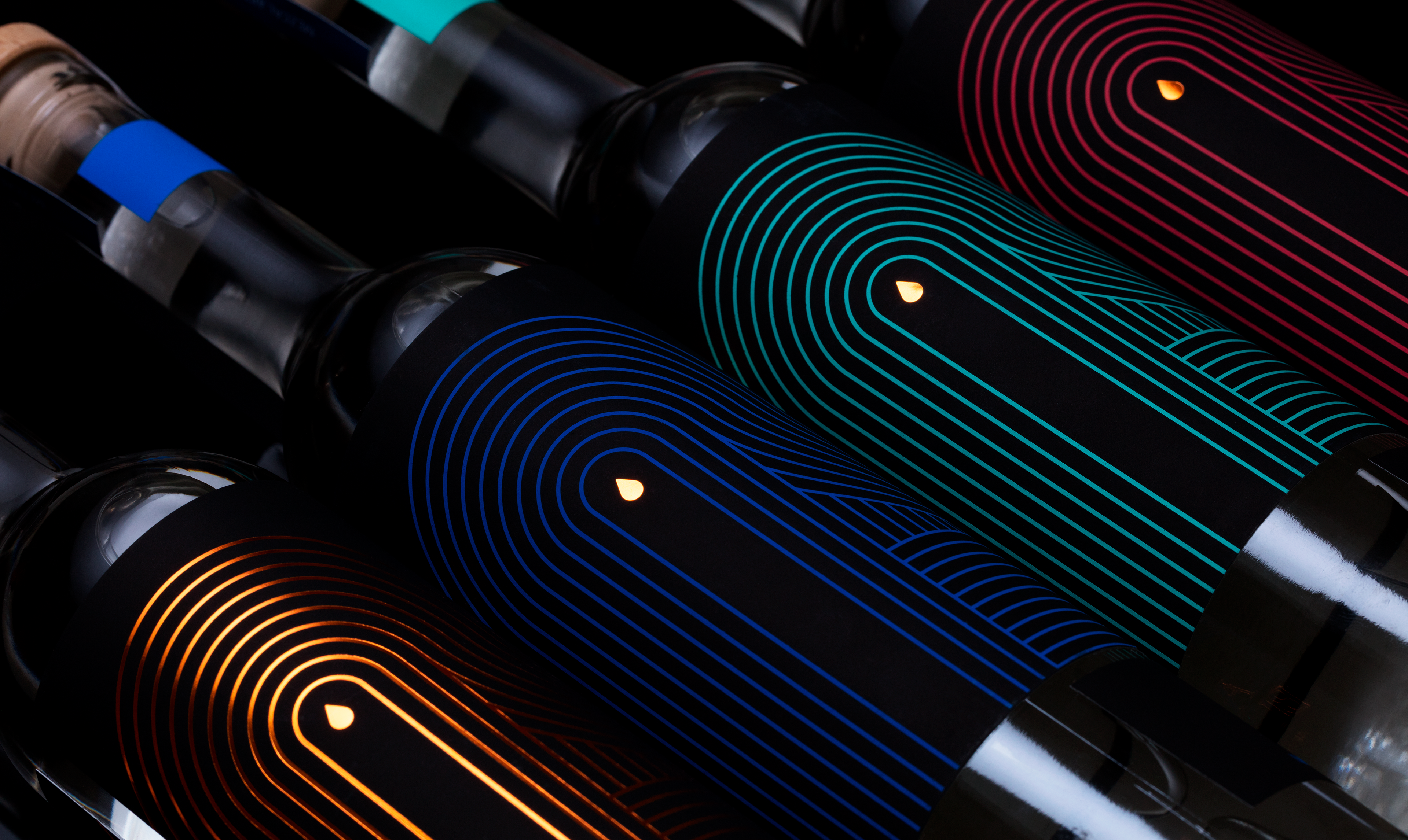
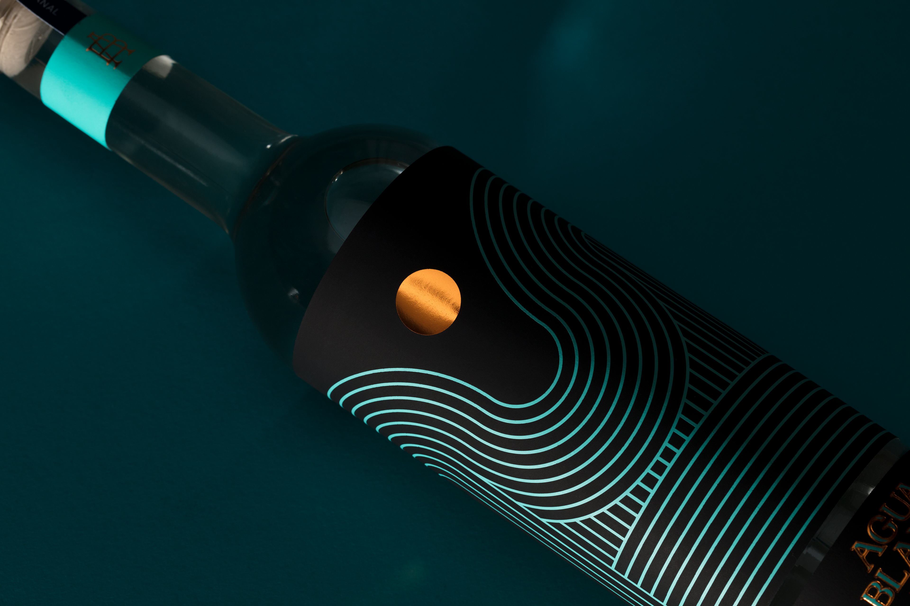
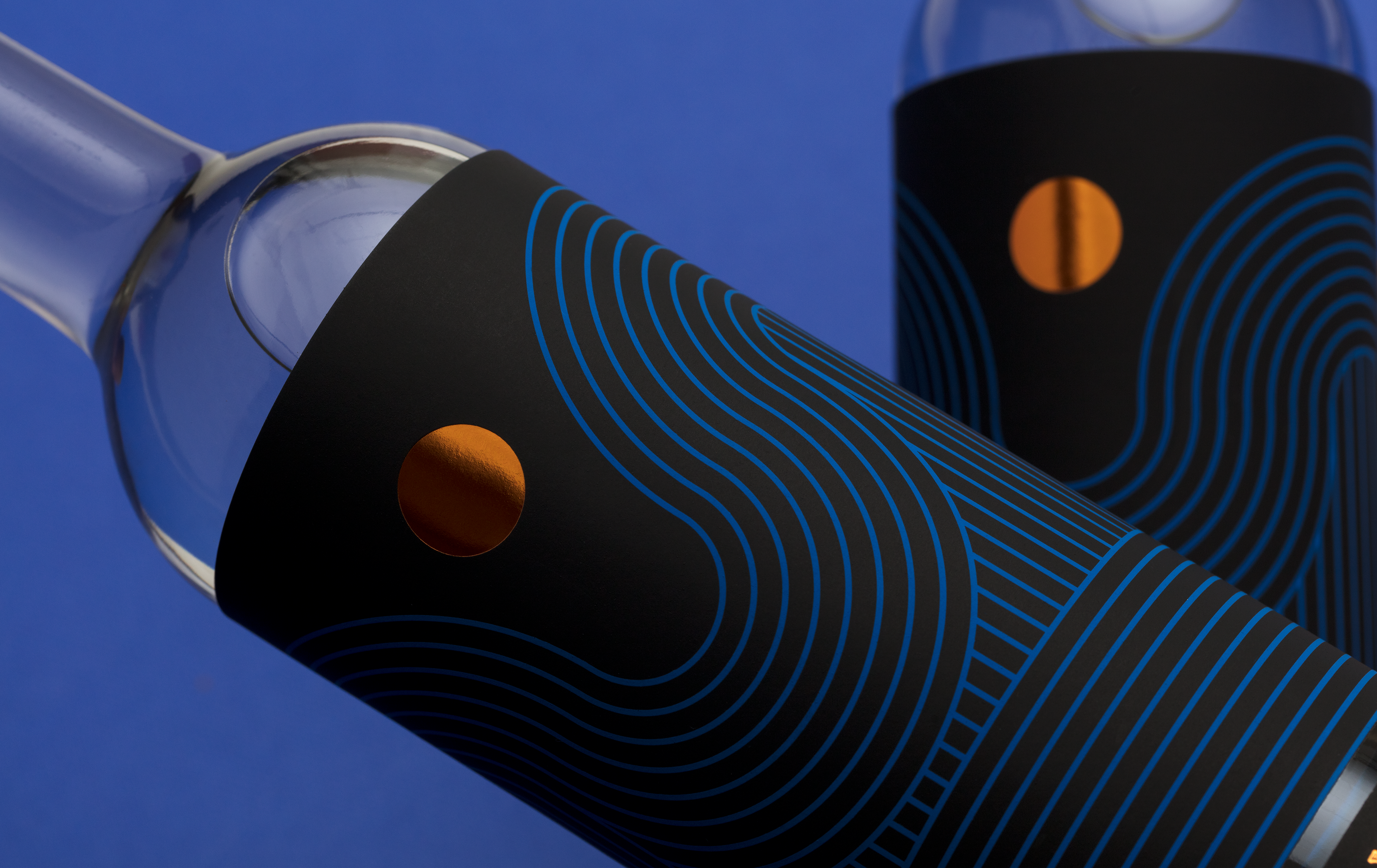
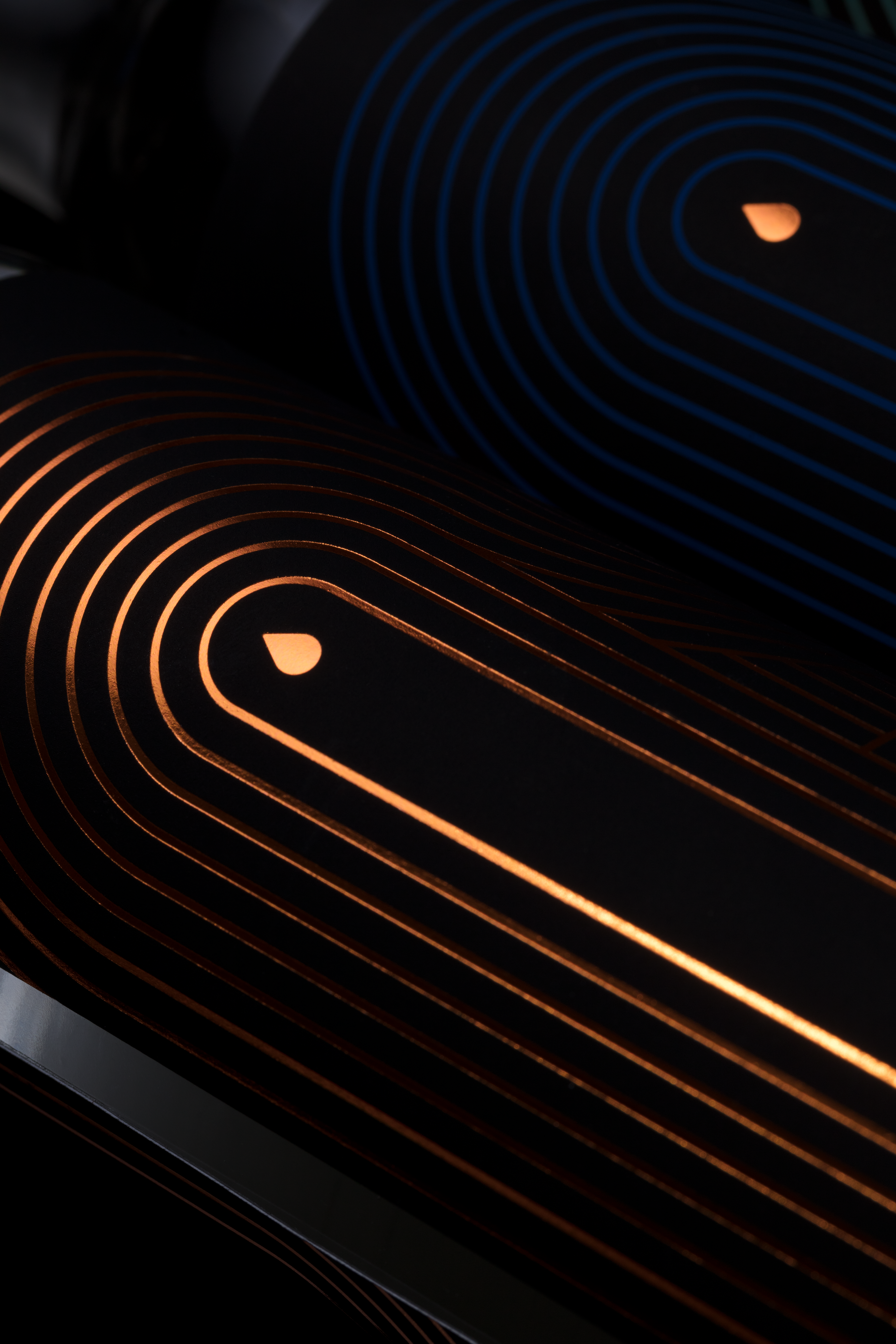
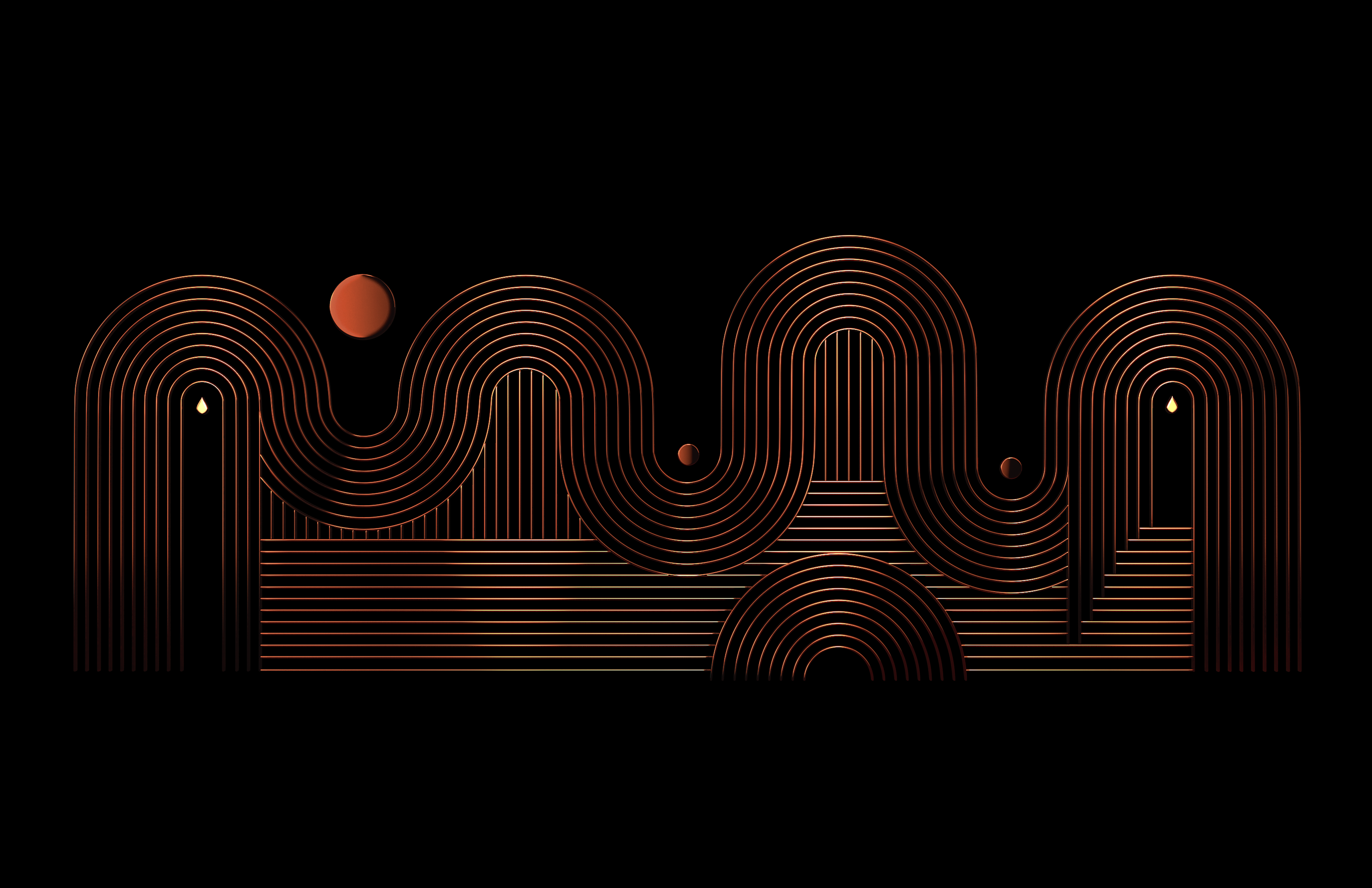
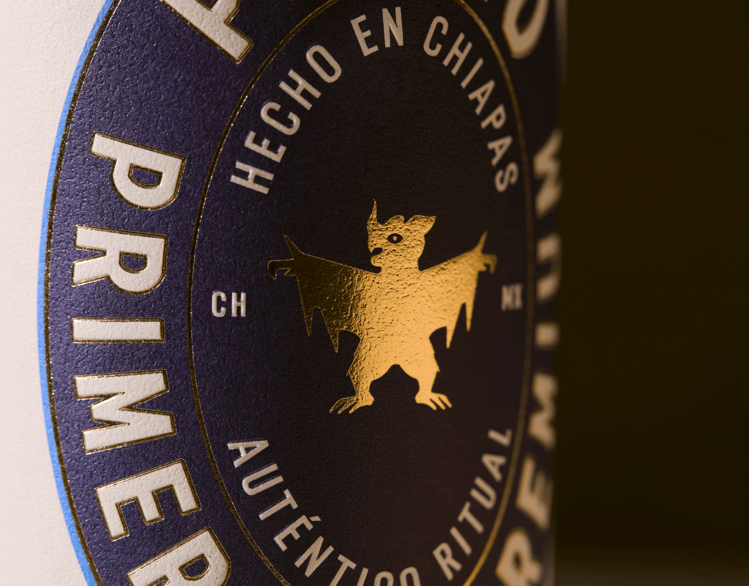
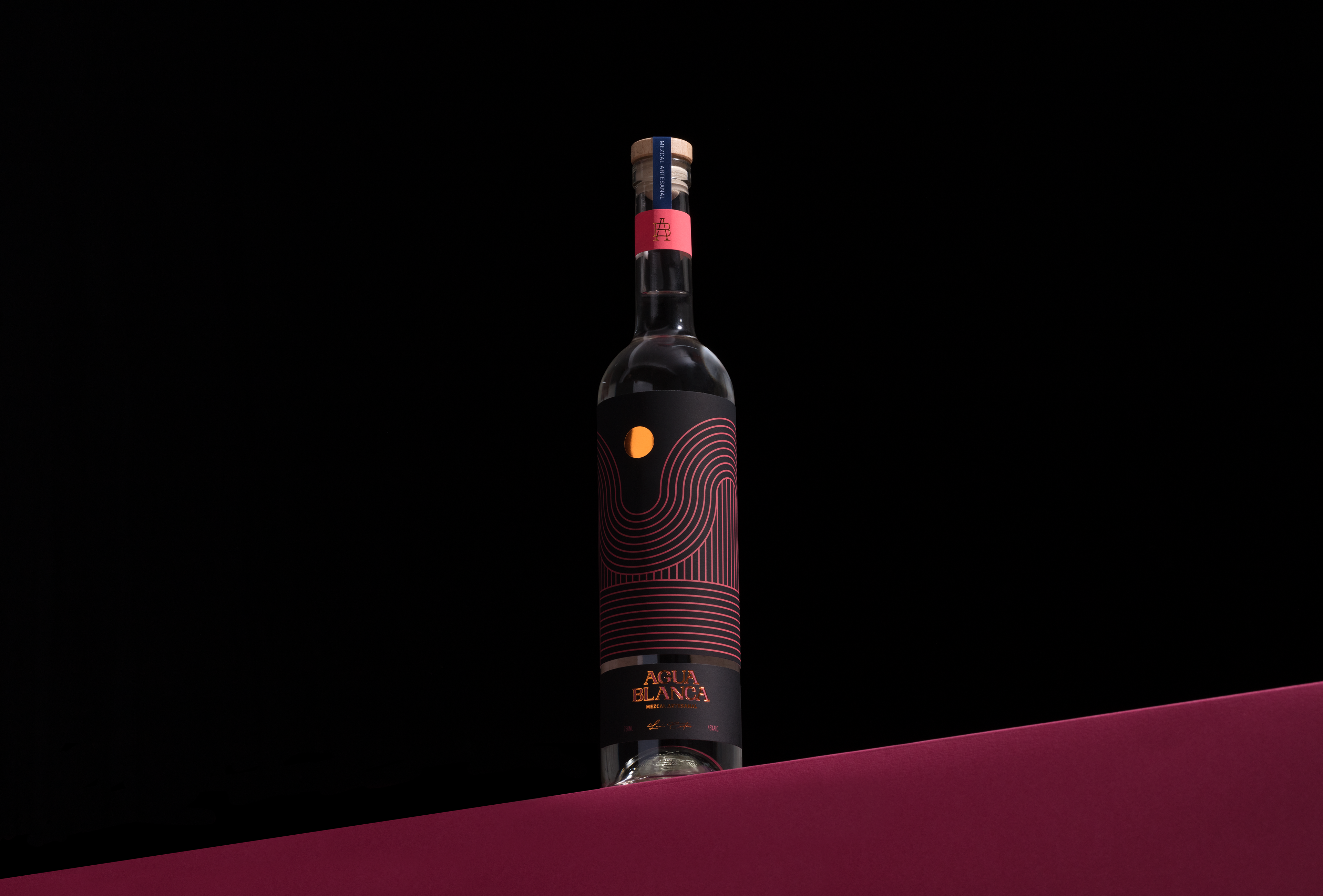
We designed and abstract pattern that tells a rich narrative behind the process of mezcal, the agave fields, the harvesting, the water, the sun, the moon and finally the agave juice but most importantly, the pattern symbolizes Mexico’s prehispanic culture; we took inspiration from the heritage found in architecture, traces and relics in our ancient civilizations.
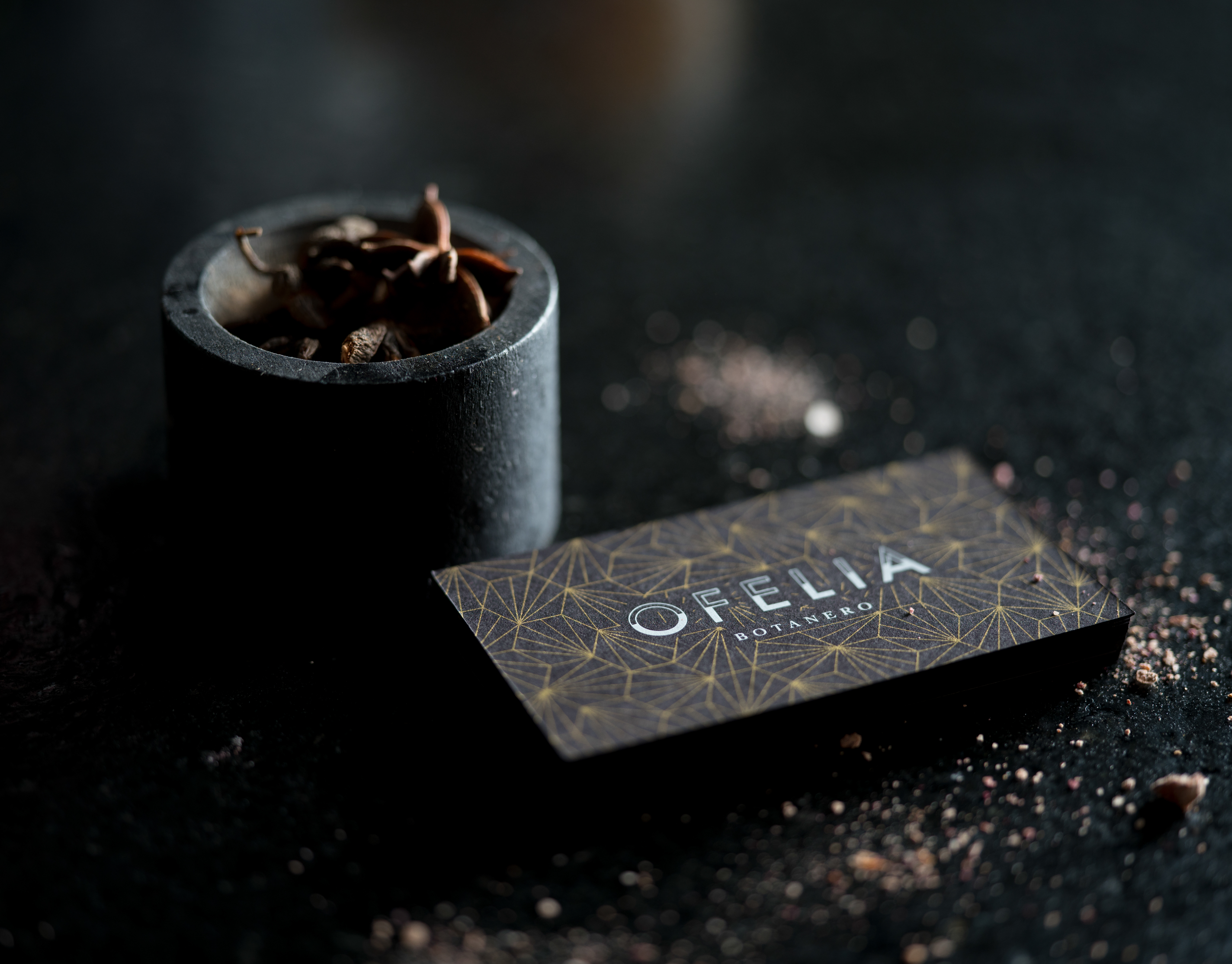
We used elements in a subtle and thoughtful way with the intention of creating an integral bottle in which the components of the label do not compete with each other, but rather complement one another.
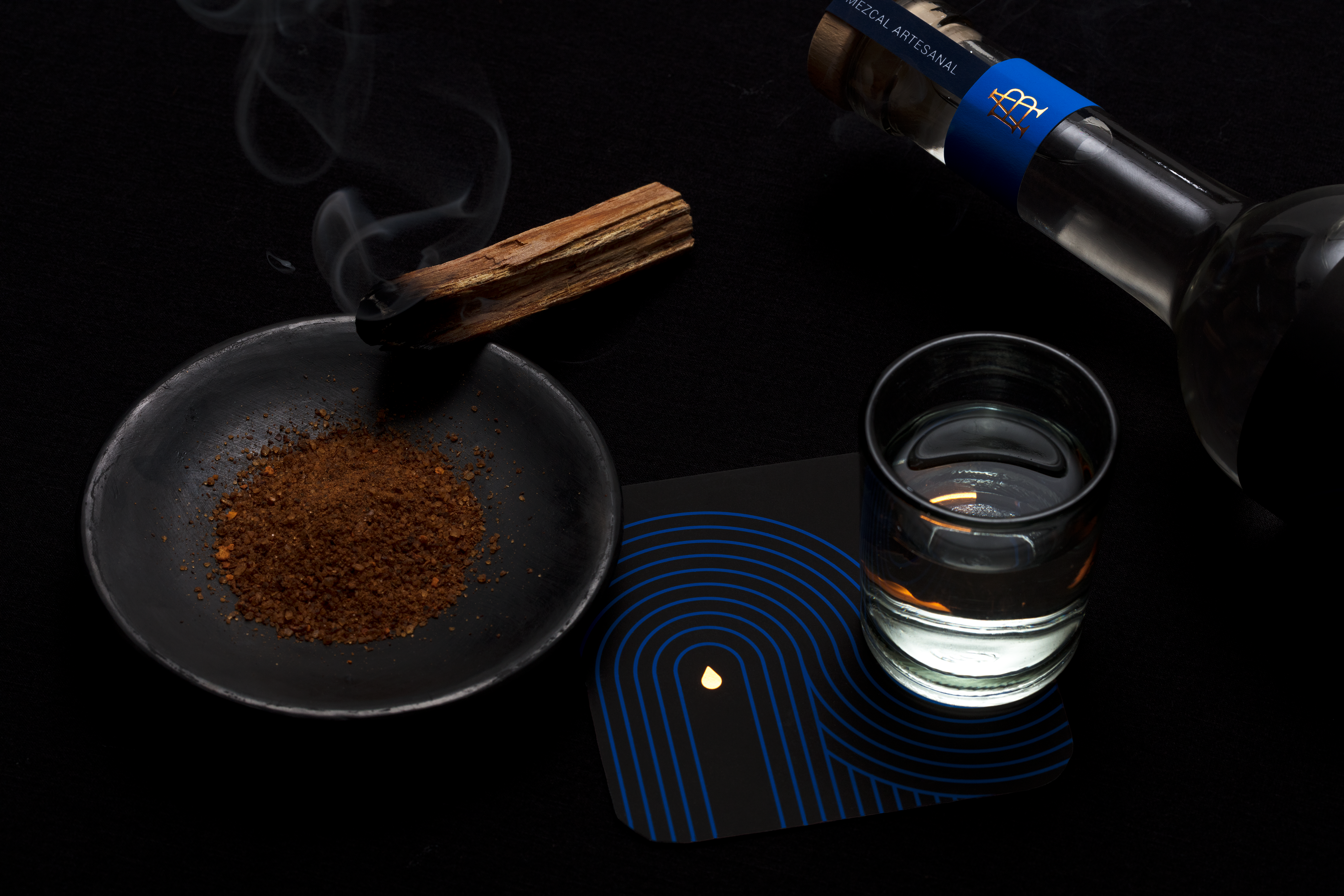
Agua Blanca portrays the tradition, the joy, the family, the union, the roots of our culture and the passion behind when drinking an exquisite mezcal.